Posts

How Microcopy Can Improve Your Web Design? (Part 1)

We already discussed what is a microcopy and how to write an effective microcopy. For this post, I will explain in detail the many uses of microcopy and how it can greatly help your website. Sometimes, when you are thinking of revamping your website, you think about having a new website design, restructure certain web elements, or rewrite product descriptions. Those are great suggestions, but sometimes, you just need one thing: microcopy. Microcopy helps by lessening their apprehensions and concerns. You need to choose the right words and it should answer specific questions that the user’s have.

  • You may ask how exactly does it takes away certain fears?

    • Irrevocable changes.

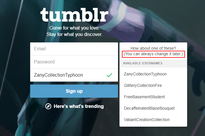
      • My example here would be Tumblr’s sign up page. If you look at carefully at the picture. You are guided to input three things: email, password, and username. For the username, they ask for a specific blog name and they even gave suggestions for you to make your username unique.

        tumblr sign up page.

      • If you want to change it in the future, you can. To remove the fear of being assigned a permanent name, Tumblr promises their users that “you can always change it later.” That small and simple statement really helps because users won’t worry about choosing the wrong username.
    • Countless number of emails.

      • Microcopy can calm the users and assure them that they won’t be flooded with unnecessary emails. So, make sure to give them an idea that you will only send this x number of emails or better yet indicate on your page that you don’t spam emails with information that subscribers do not want.
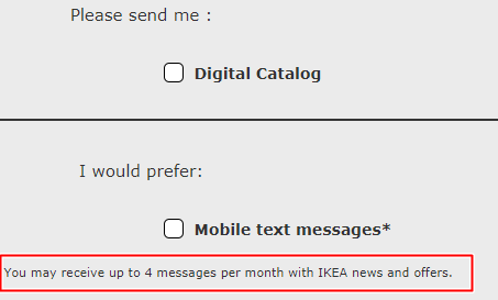
      • Look at the IKEA sign up form below. Users are asked if they either want a print, digital catalog, or even mobile text alerts. They are guaranteed that IKEA will only send up to 4 messages a month. That way they won’t hesitate to share their personal details.

        Ikea’s catalog options.

    • Data loss.

      • No one likes losing 30 pages of research and extensive data analysis. Hours of toil will all be useless if the data provided are not kept safe. An autosave feature along with a microcopy could go a long way and could provide relief to many users. For this reason, the nightmare of many users will be alleviated and the fear of suddenly losing the results of their hard work will be erased.
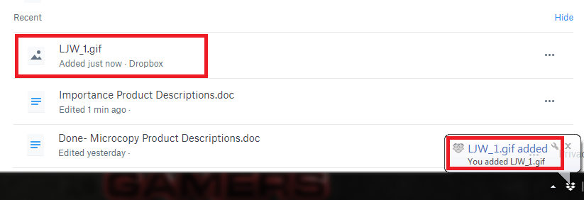
      • In the example below, Dropbox offers a real-time update both on the desktop app and on the website. The app notified that a .GIF new file has been added or saved into the provided Dropbox account. If you look at the website version, the same is indicated. A new .GIF file has been added along with a list of recently edited files.

        dropbox notification

      • Certainly, this simple notification saying that “a file has been added just now” erases all the doubts that any progress has NOT been saved. It provides relief that the files are safe and secure.

Therefore, Microcopy may be small in size, but it definitely has a big impact.

Almost all users would ask, “Why would a website need so much information? I just want to get on with my purchase.” Generally, people are  afraid of putting their personal information online because they think it’s somehow an invasion of privacy. That’s why it is important to add a microcopy to provide further explanation. Hence, it is important to stress certain statements to help users have a positive web browsing experience.

7 Tips in Writing An Effective Microcopy

facebook login

Microcopy on Facebook’s login form.

Microcopy may be a small thing, but it doesn’t mean it is insignificant. It takes more than good writing skills to create a compelling microcopy. There are various elements to consider and I will list several helpful microcopy tips to make your website more user-friendly and easy to use.

  • Tip 1: Design a microcopy from the user’s POV.
    • For the most part, microcopy is not for your users. It is there to help them complete whatever form or transaction they need. You can only design a good microcopy if you consider the user’s perspective. Ask yourself a variety of what if questions and put yourself their shoes. What would be the questions they would ask? Is there a process that could have been handled better?
    • It is important to identify the different areas that are clear, and the sections that needs improvement. Every step of the way, the given microcopy should be able to address the concerns of website visitors.
  • Tip 2: Microcopy should be brief and precise.
    • Microcopy isn’t added to bring color or flavor. It is there to guide. When writing one for your website, be sure to use short sentences or even phrases will do. Your web visitors won’t have forever to read through your detailed instructions. It is called microcopy for a reason because words are supposed to be condensed and not lengthy.
  • Tip 3: Jokes are not for everyone.
    • What is funny to you is not funny to another person. Be careful when you add a little sense of humor to your microcopy. Jokes are very subjective and it really depends on the person reading it. Aside from that, what may sound good in real may not be appropriate when written down. Readers may find it very offensive and rude of you to say such things.
    • For example, after filling out a complicated and wordy sign up form, you will jokingly inform your website viewers that you lost the data inputted. Imagine how that “Oops! We didn’t save that. Please try again.” That would definitely infuriate your users. Instead of creating a cheerful atmosphere, an inappropriate joke will cause unnecessary stress.
  • Tip 4: Add images to your microcopy.
    • Words and pictures are the perfect pair. When words fail, a simple photo guide will greatly helpful. Collectively, they work together to assure the users that everything is fine and they are on the right track.
  • Tip 5: Do not use jargons.
    • Remember that microcopy is added to simplify highfalutin information. Do not bombard your users with complicated and confusing terms. As much as possible, use natural language and write as if you are talking to another person. When your users can relate or identify with you through your language, they will surely trust you. They will be thankful that you made things easier for them!
  • Tip 6: Be cautious when using idiomatic expressions.
    • Like jokes, not everyone will “get” the idiom you are using. Some people will be less familiar with it because of terminological and cultural differences.  Remember tip number #2! Stick to simpler terms and phrases. Straightforward microcopy is the best way to go with it.
  • Tip 7: Test your microcopy.
    • No one gets it right the first. There’s always a “practice” round. Good things take time and it also applies to microcopy. Test, rewrite if needed, and apply new changes. Allocate some time for experimentation to what works and what does not work. You can even ask your users for their opinion by conducting a usability survey.

That Thing Called Microcopy

Letters

Microcopy: it’s all about the smallest details.

In creating websites or apps, there are those littlest details you may not notice yet they are extremely important. Microcopy is essential to our online lives. On a daily basis, we deal with it. Some of you may have noticed it while some haven’t. These microcopy help guides may be tiny, but they serve a huge purpose. From undervalued cues when you enter a website for the first time to the miniscule prompts on the progress bar that will update on what’s happening. A microcopy is a deciding factor whether a user should or should not continue exploring your website.

So what is microcopy?

  • The tiny chunks of text in an app or website is called microcopy. These are not just texts because they are added there to guide the user. These words are blended well into a page that it may go unnoticed most of the time, but without them, users would end up confused on what to do.

When should you use microcopy?

There are many uses of microcopy and you can know about it in detail on this blog post. The two main purposes of it is a) to motivate a user to take an action and b) to emphasize an important statement.

  • Microcopy helps your users through the several form fields in your website. However, it’s not limited the only the users, but it is also beneficial to you. Because of the cues inserted on form fields, you will gain correct details from your users. You are sure that the details inputted are accurate all thanks to the well-placed microcopy.
  • Microcopy encourages users to click that call-to-action (CTA) button without being much of a hard-sell. It can be used to subtly guide users to do what you want them to do.

How should you go about it?

The microcopy hints and guides will all depend on your branding. Generally speaking, these tips will help you get started on the right direction. Follow the instructions given below:

  • It is important to your user. Design prompts and field from their perspective. Try to know what they are thinking and feeling the moment they see that page on your website. Empathize with your users and let them know that you are on their side.
  • Pay attention to the littlest details. During the usability testing, read and analyze the actual words used. Listen to the opinions of your teammates if certain words create confusion or if these messages are clearly explained.
  • It should agree to your brand. If your brand identity is known to be humorous, add a witty voice. You should be able to guarantee that the unique style and conversant tone of your microcopy coincides with your brand so your users are ensured a smooth browsing experience.

As a final word, you have to make sure the word choices are clear and the statements on point. By the time your users read your microcopy, they should know what they need to do at that given moment. It is your duty to direct them to the right track whenever they take a wrong turn. If they made a mistake, your microcopy should offer a helping hand on how to fix things. More tips on how you should create an efficient microcopy are all here.

© 2017. All rights reserved. Phoenix Website Design • Sitemap • (602) 388-8622
20 E Thomas Rd #2200, Phoenix, AZ 85012
Phoenix Web Design

Serving: 

Apache Junction, Avondale, Buckeye, Carefree, Chandler, Chandler Heights, El Mirage, Fountain Hills, Gilbert, Glendale, Goodyear, Litchfield Park, Mesa, New River, Paradise Valley, Peoria, Phoenix, Queen Creek, Scottsdale, Sun City, Sun City Grand, Sun City West, Surprise, Tempe, Tolleson, Wickenburg