How to Choose the Colors for Your Website
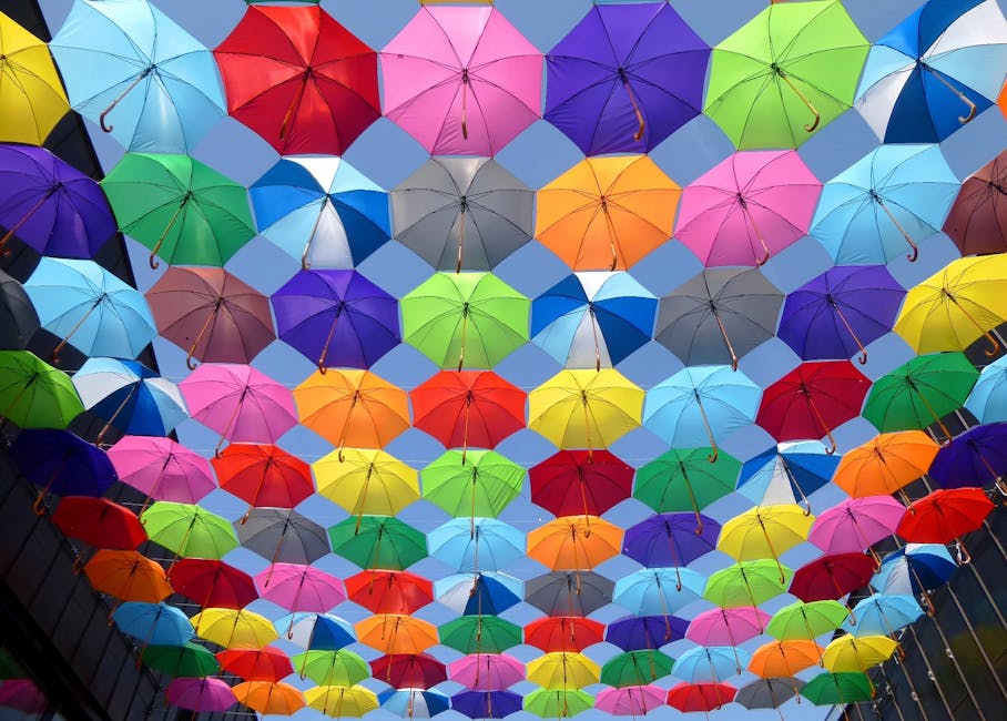 Color is the most effective way of creating an impression. It communicates with the users emotionally. The combination of colors will definitely give your website a unified look. There are ways of choosing a color combination.
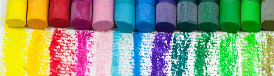
To select your color palette, it is important to study your brand colors. Go for the colors that represent your product or your service. You can use a color scheme tool for this.
- COLOURlovers – You can view the latest color trends here. A wide community, where people create and collaborate.
- ColoRotate – This is web application, where you can test different colors, mix them, and adjust to your own liking.
- Adobe Kuler – This is similar to ColoRotate, but this one has suggestions. You can choose a color rule and it will give you guidelines on choosing the appropriate colors. This is perfect if you cannot decide on which colors to choose.
- Paletton – What is great with Paletton is that it has a randomizer. When you are confused to what colors to use, just click on the randomizer and it will choose for you.
Consider the color symbolism. Study the perceptions and emotions to the different hues. Remember that, same colors can give different emotions to different people. The best way to do this is to think of your target market. Choose the colors that can represent your audience.
There is no hard and fast rule when it comes to colors. The 60-30-10 rules of the fashion and interior designers says that three colors should be used in different degrees to come out with the perfect harmony.
- Primary color should be about 60% of the space to unify the theme.
- There should be a 30% contrast with the 60% to give a striking effect.
- Accent color should be 10%. This should complement the primary or secondary colors. It is also used to highlight material on the web site like a call-to-action.
Think of your business goals. If your website needs an action in someone, choose colors that can move an emotion to your site user.
Experiment with colors. You can start with five colors and then, add or subtract based on how you develop your design.
Shades and tints can be used when you have five colors. A content-rich web page is a perfect example for this as it needs to separate captions, side bars, and tables from the content. The outcome consolidates the design that a fourth or fifth color is not necessary. Shades and tints can be used for additional color and they do not clash with your color scheme.
The psychology of colors are being used by several market researchers and brand managers to promote product engagement. For example, the restaurants uses orange and red, financial institutions or banks uses blue, hotels uses white, blue, black or green and luxury products are elegantly packaged in black.
One important factor in your color is your background and your text. There should be a color contrast in the font and the background. This brings the website page forward and the focus will be on the website itself. Black text is still the best. It is easy on the eyes and people are used to reading black text. Otherwise, light on dark or vice versa is good.
 A website is a powerful tool to communicate with the world. Whether it is personal or your way of informing people, selling, or any other reason. Your website has a lot of possibilities and the internet is the best place to reach a wide international audience at a very low cost. That is why choosing the right colors for your design in equally important.
