Posts

3 Web Design Tips from Amazon (Part 1)

Previously, I’ve discussed Amazon’s ability to upsell, cross-sell, and pre-sell. Now, we will go into details on how they use these strategies. Amazon wouldn’t be the eCommerce giant it is now without these tips and tricks. Below, I will be giving concrete examples and helpful links that will help your online store gain more clicks. So, without further adieu…

Here are 3 web design tips you can learn from Amazon:

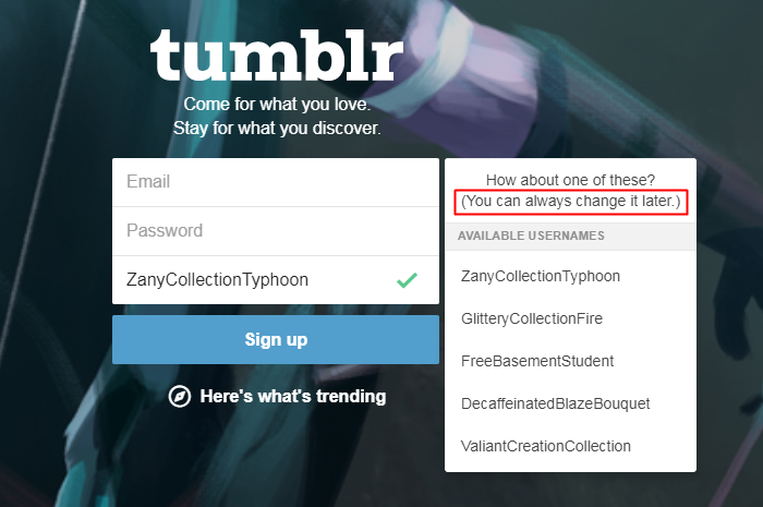
  • Tip #1: Colors are important.
    • If you look at Amazon’s product page, you will notice that texts are usually black. Hyperlinks, or the clickable links, are distinguishable because of its light blue color while the prices are noticeable in red.
    • Why is this? Behavioral psychologists suggest that customers tend to click blue links more. The color blue relaxes the mind. Thus, it increases trust and confidence in buying different items online.
    • On the other hand, the color red is connected to bravery and courage. Amazon puts their prices in red for a reason and they would want their customers to take courage. Subtly, it is suggesting to add that item in their shopping cart. It’s no surprise that other websites also use red to promote their annual Christmas sales or their limited-time offers.
    • Choosing the wrong color can make customers leave. So, it’s crucial to think about the different colors when designing a website. I’ve listed the basics of color psychology here. If you need help with choosing colors, these color scheme tools will definitely help you.
Colorful Houses

Learning the uses of colors is important.

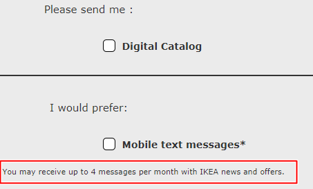
  • Tip #2: Create an urgent need for a product.
    • When customers find out that there’s only a limited number left, they will started hoarding no matter what the product.
    • Clearly, Amazon have mastered this and they will indicate how many are left. That’s a powerful strategy right there especially if the customer has been eyeing the product for some time now. It’s going to be hard to resist if he sees there’s only 5 left.
    • Does it work? Yes, because scarcity increases the demand. CXL, an online institute that offers marketing degrees, reported an increase of their sales by 332% when they mentioned that there were only 5,000 slots left. Naturally, people went crazy and they started signing up immediately.
      • How can you create a huge demand for a product?
      • First, you need to identify the need. Ask your email subscribers what to do they too see more on your website. In order to do this, you can create a simple survey for time to answer.  Create forms for marketing and research using these free tools like Tellform, UserReports, and Google Form.
      • Indicate in your survey the specific quantity you are going to release once you received a favorable response from your audience. You need to include also the details of the products or services, such as one-on-one training that gives them exclusive access to hundred of online resources, 50 pieces of personalized journal with tons of freebies, a digital marketing webinar that caters to only 30 participants, and so on. You have to be very specific to get your audience’s attention.
Person Holding a Poke Ball

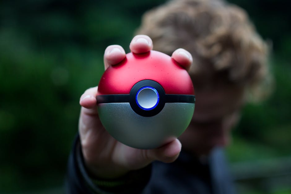
Person holding a Poké Ball.

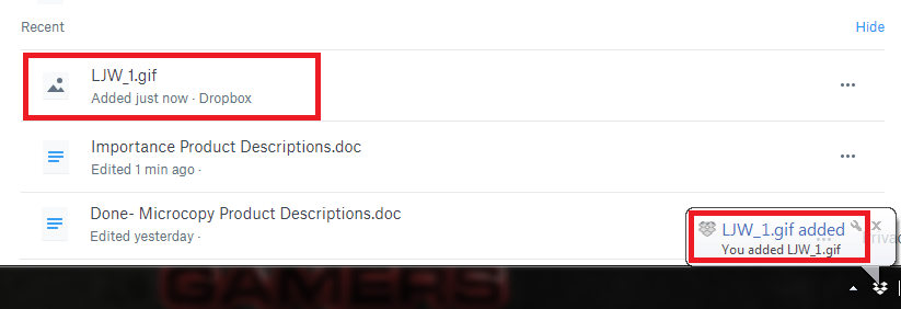
  • Tip #3: Group related items together.
    • Amazon does an amazing job in presenting related products together. Their electronics buying guide will encourage you to buy without much of a hard sell. There’s a Nintendo Switch console for sale, and Amazon will suggest other items like the console’s best-selling game: Pokémon: Let’s Go, Pikachu!
    • Both products are sold by Nintendo, which means customers will likely buy them both to save on shipping costs. The take away here is to find out what makes your audience click that “Buy Now” button. For Pokémon fans, seeing the Poké Ball Plus will surely make them click. An additional $40 is nothing to them as long as they get to hold an actual Poké Ball while playing the game.
    • Though you already have a controller for the Nintendo Switch console, the Poké Ball Plus will bring diehard fans back to their childhood. It brings back the old memories. It’s very nostalgic for them so when planning a website, you should know what can make your customers buy an item.

How Microcopy Can Improve Your Web Design (Part 2)

In the first part of our microcopy discussion, we talked about how a good microcopy can alleviate fears and apprehensions. This time around, we will dig deeper into the several ways that microcopy helps users. Despite its smallness, microcopy is effective in guiding users throughout your website. Almost every transaction clients make on your website involves words.

A dialog box won’t be complete without any microcopy prompt. Empty fields will be confusing without any microcopy guide on what to put. Therefore, you should not undermine the importance of microcopy in achieving an excellent web design.

Here are 4 ways on how a microcopy can help users:

Navigating a website can be tricky without any clear “road sign” on where to go, what to do next, and how to complete a task. There should words that are ready to assist any web visitor. A good microcopy allows a smooth transition from point A to B.

  • Helps users what to do.

    • A website’s user interface should be natural and perceptive of the user’s way of thinking. When someone browses your website, he should be able to tell what do at this moment.
    • Take a look at Facebook’s home screen. The moment you enter your username and password, you will immediately notice the status box. There’s a microcopy saying, “What’s on your mind?” Naturally, users will have an idea on what to do the moment they log in on Facebook.

      Facebooks asks about your thoughts for today.

    • If you look up, there’s also a search bar just above the status box. A microcopy indicates that is where you should input your search keywords. At a glance, users know the different parts of the website through its microcopy.
  • Helps users to take action.

    • A good microcopy convinces users to do something willingly. In the example below, Tenta’s newsletter reminder reassure users that they value privacy and will not give out personal details such as name and email address.
    • Generally, people are hesitant if they should sign up or not. Plus, it gets more difficult if users are required to pay for the subscription. Therefore, a microcopy can really help in reassuring users that every transaction is secured and privacy is not breached.

      Tenta explains their privacy settings.

  • Helps boost your website’s engagement.

    • Microcopy can give your users a nudge to do something. The example below is Shopee’s cart page. When the shopping cart is empty, it encourages people to go shopping and keep searching for products they might like.
    • The best thing about this microcopy is that it is paired with an image. A shopping bag is smiling at the users to give them a friendly and subtle hint to stay and shop some more.

      Shopee’s empty cart is smiling at you.

  • Help users know what to expect.

    • In Facebook where privacy is a main concern for most people, a microcopy is inserted in many parts of the website.
    • In the settings where you are asked on who can see your friends list. You can set it to “only me.” However,  below that, there is a reminder that your friends control their own Timelines. Your activity with a certain person will be visible in their Timelines. So, your friendship can be seen in the News Feed and other parts of Facebook even to those people you are not friends with.

      Facebook reminds users about the visibility of their friends list.

How Microcopy Can Improve Your Web Design? (Part 1)

We already discussed what is a microcopy and how to write an effective microcopy. For this post, I will explain in detail the many uses of microcopy and how it can greatly help your website. Sometimes, when you are thinking of revamping your website, you think about having a new website design, restructure certain web elements, or rewrite product descriptions. Those are great suggestions, but sometimes, you just need one thing: microcopy. Microcopy helps by lessening their apprehensions and concerns. You need to choose the right words and it should answer specific questions that the user’s have.

  • You may ask how exactly does it takes away certain fears?

    • Irrevocable changes.

      • My example here would be Tumblr’s sign up page. If you look at carefully at the picture. You are guided to input three things: email, password, and username. For the username, they ask for a specific blog name and they even gave suggestions for you to make your username unique.

        tumblr sign up page.

      • If you want to change it in the future, you can. To remove the fear of being assigned a permanent name, Tumblr promises their users that “you can always change it later.” That small and simple statement really helps because users won’t worry about choosing the wrong username.
    • Countless number of emails.

      • Microcopy can calm the users and assure them that they won’t be flooded with unnecessary emails. So, make sure to give them an idea that you will only send this x number of emails or better yet indicate on your page that you don’t spam emails with information that subscribers do not want.
      • Look at the IKEA sign up form below. Users are asked if they either want a print, digital catalog, or even mobile text alerts. They are guaranteed that IKEA will only send up to 4 messages a month. That way they won’t hesitate to share their personal details.

        Ikea’s catalog options.

    • Data loss.

      • No one likes losing 30 pages of research and extensive data analysis. Hours of toil will all be useless if the data provided are not kept safe. An autosave feature along with a microcopy could go a long way and could provide relief to many users. For this reason, the nightmare of many users will be alleviated and the fear of suddenly losing the results of their hard work will be erased.
      • In the example below, Dropbox offers a real-time update both on the desktop app and on the website. The app notified that a .GIF new file has been added or saved into the provided Dropbox account. If you look at the website version, the same is indicated. A new .GIF file has been added along with a list of recently edited files.

        dropbox notification

      • Certainly, this simple notification saying that “a file has been added just now” erases all the doubts that any progress has NOT been saved. It provides relief that the files are safe and secure.

Therefore, Microcopy may be small in size, but it definitely has a big impact.

Almost all users would ask, “Why would a website need so much information? I just want to get on with my purchase.” Generally, people are  afraid of putting their personal information online because they think it’s somehow an invasion of privacy. That’s why it is important to add a microcopy to provide further explanation. Hence, it is important to stress certain statements to help users have a positive web browsing experience.

That Thing Called Microcopy

Letters

Microcopy: it’s all about the smallest details.

In creating websites or apps, there are those littlest details you may not notice yet they are extremely important. Microcopy is essential to our online lives. On a daily basis, we deal with it. Some of you may have noticed it while some haven’t. These microcopy help guides may be tiny, but they serve a huge purpose. From undervalued cues when you enter a website for the first time to the miniscule prompts on the progress bar that will update on what’s happening. A microcopy is a deciding factor whether a user should or should not continue exploring your website.

So what is microcopy?

  • The tiny chunks of text in an app or website is called microcopy. These are not just texts because they are added there to guide the user. These words are blended well into a page that it may go unnoticed most of the time, but without them, users would end up confused on what to do.

When should you use microcopy?

There are many uses of microcopy and you can know about it in detail on this blog post. The two main purposes of it is a) to motivate a user to take an action and b) to emphasize an important statement.

  • Microcopy helps your users through the several form fields in your website. However, it’s not limited the only the users, but it is also beneficial to you. Because of the cues inserted on form fields, you will gain correct details from your users. You are sure that the details inputted are accurate all thanks to the well-placed microcopy.
  • Microcopy encourages users to click that call-to-action (CTA) button without being much of a hard-sell. It can be used to subtly guide users to do what you want them to do.

How should you go about it?

The microcopy hints and guides will all depend on your branding. Generally speaking, these tips will help you get started on the right direction. Follow the instructions given below:

  • It is important to your user. Design prompts and field from their perspective. Try to know what they are thinking and feeling the moment they see that page on your website. Empathize with your users and let them know that you are on their side.
  • Pay attention to the littlest details. During the usability testing, read and analyze the actual words used. Listen to the opinions of your teammates if certain words create confusion or if these messages are clearly explained.
  • It should agree to your brand. If your brand identity is known to be humorous, add a witty voice. You should be able to guarantee that the unique style and conversant tone of your microcopy coincides with your brand so your users are ensured a smooth browsing experience.

As a final word, you have to make sure the word choices are clear and the statements on point. By the time your users read your microcopy, they should know what they need to do at that given moment. It is your duty to direct them to the right track whenever they take a wrong turn. If they made a mistake, your microcopy should offer a helping hand on how to fix things. More tips on how you should create an efficient microcopy are all here.

The Evolution Of eCommerce Websites


bandwidth, close-up, computer

You might think technology is easy and convenient to use but it is rather complex. Business-wise, we went from manual and laborious operations to fast and easy online transactions. That is how technology changed the business game or the entire game in general.

With all that being said, have you ever heard of serverless technology? According to Wikipedia, the term “serverless” is frequently used to mean cloud services or platforms that allow developers to be completely free of concerns around an operating system and run code that is only instantiated as needed and billed based on execution time.

Functions as a service (FaaS) are a subset of the broader serverless term, meaning a capability that supports running individual code functions (not entire applications). The most commonly used example of a serverless capability (an FaaS specifically) is AWS Lambda from Amazon Web Services.

So what is the deal?

It is not easy for new methods to immediately capture the hearts of clients especially if companies have religiously used these conventional methods ever since the start of their businesses. Which is why the success of the serverless community can be quite of a shock to the conventional mediums because statistically, serverless technology has sky-rocketed to the top of the business leader board. But how did it exponentially grow? Three reasons: LOWER COSTS, FASTER DEPLOYMENTS, and GRACEFUL SCALING.

Why is this important?

Aside from adapting to what is hip and current, one of the reasons why this is ideal is it will minimize your cost and expenses. Because it is serverless and it is a technological advancement, it is cheaper than the traditional hosting. You can read a bunch of testimonies online about how companies have cut down their costs because they turned to serverless technology.

HOW WILL THIS WORK FOR YOUR BUSINESS?

  • CMS

  • A content management system (CMS) manages the creation and modification of digital content. It typically supports multiple users in a collaborative environment. CMS features vary widely. For the first step, use a caching system to create static pages from the CMS to be served by a cloud service provider. You have various options to use but if you want it to be easy to use and affordable, use something like Amazon Eslasticache.
  • CATALOG

  • Sometimes when your website displays a ton of products and variations, it can cause a major setback to the speed of your browsing. You need to figure out a way to minimize this obstacle. The best proven way is using micro-services so that every interaction that the user can have with the website can be split into smaller sections.
  • CARTS

  • Carts might just be carts but they eat up a lot of your CPU. In your traditional store, MySQL bottlenecks and everything can go downhill from there so to stop that from happening you can use something like AWS Lamba or Dynamo DB. You can do your own in-depth research on how this helps your carts, especially for those who usually place a ton of orders but generally, it is just easy to set up, it is more budget-friendly and it is just what you needed to complete an effective use of the serverless technology.

So why are there people who still aren’t jumping on the bandwagon?

Aside from it being cheap, it is also timely to use a system that is advanced and more effective. The serverless community is relatively new in the market and it would be a commitment to use such technology on people’s business’ websites which is why it is completely understandable if people would still have a hard time to switch. Yes, it is tough to enter a new realm especially when your whole business is at stake but our world is getting more advanced year by year and in one way or another we would all need to catch up.

What You Need to Know About Chatbots

Two White Message Balloons

We all live in a world that extremely dependent on the wonders of technology.

Everything that we do now basically has technology as its best medium and support. One of the greatest things that technology has brought to our lives is the convenience of communicating with one another. In today’s age, there are countless of platforms that can be utilized for communication and they definitely make our lives a million times better. The first thing we need to discuss about is CHATBOT and its basics.

How is this relevant to your website and its success? How will it help?

Back to the discussion, now, what is CHATBOT? A chatbot, according to Google, also known as a talkbot, chatterbot, Bot, IM bot, interactive agent, or Artificial Conversational Entity is a computer program or an artificial intelligence which conducts a conversation via auditory or textual methods. In layman’s term, it is a medium for communication.

So what is its relevance to your website?

Competition is getting out of hand. There are a lot of businesses out there that offer various services and they even have tricks up into their sleeves because the competition is tight. Using CHATBOT might just be one of your tickets to outshining your competitors.

HOW IS THAT EXACTLY?

Use it as an extension to your website. Use this to your advantage and the most perfect way to put this is to use it as your internet personality or your social voice. You need to be able to answer questions like, “How should we get this across our customers?”, “What tone should we set for them?”, “Should be even bother use emoticons?”, “How are we going to communicate this to our clients?”.

This will also set your hospitality as a brand. This will help all websites set their tones for their brands and that is exactly what you want to get across to your clients as an eCommerce website. CHATBOTS are a great communication tool. It will not only help you as a web designer or a web design agency, but it will also help your clients with their business endeavors. It helps businesses get in touch with their clients effectively and efficiently as opposed to your conventional email marketing which is also a great tool but it is just too dated for the modern age.

STEPS ON GETTING STARTED:

  • LEARN

    Before you jump on any wild decisions, you need to think things thoroughly. Acquire even the basic knowledge that you can have about CHATBOT so that you will not have any trouble dealing with its complexities in the long run.

  • PARTNER UP

    If you have reached the conclusion that CHATBOT would be a great addition to your website, it is best if you find the best CHATBOT building company that you can surely rely on.

  • GET TO PITCHING

    Last but not the least, scroll through your existing client list and think about which would benefit from automating parts of their business processes using a chatbot. Basically, spread the good word about CHATBOT.

The On-Site Search Feature on Your Website

Close-up of Text on Wood

The best feature that you can possibly add to your website is easy navigation.

  • No one would want to go through a website that has one too many complications. You have to consider the level of expertise of majority of your users in terms of computer literacy and most of them only know the basics.
  • It would be such a pain if your customers would always rely on google to redirect them to the links that relate to your site. Which is why a navigation bar with a descriptive page names is the first step toward keeping visitors engaged, but if you have a lot of details on your site, it’s vital to include an on-site search feature as well.

THE PROS OF CONSTRAINED SEARCH

  • In today’s time, you can literally search everything in Google. You can type in just a few words or type in a whole sentence, press enter and that is about it. You can have your desired results. Sometimes though, it can be very overwhelming to see the sea of results posted on the internet.
  • This is why constraining your search can also be very helpful. You can do this by limiting the search box according to different classifications desired by your users. This will make it easier for your clients because it will give them more relevant results that are related to their desired topic.

OPEN-ENDED SEARCHES

  • While constrained search is very useful, most websites use open-ended search strategy. It could also be too limiting if you only allow one or two searches which is why open-ended search method is still widely used. But if you plan to use this type of search, you need to make sure that the accuracy of the search will lead your customers to the most relevant results that they could find because it would be very frustrating to only look up for a particular word and then you are swarmed by a million other articles that are not even related to the topic.
  • Your on-site search must be set up to look for the exact phrase first. Although the articles that aren’t related could still show up, they should be filtered to land underneath the most relevant results. The same process is important for eCommerce sites.

CONSIDER DIRECT SEARCHING TO SPECIFIC PAGES

  • You can either use constrained or open-ended search, whichever is more suited for you website or you can also skip the search page if you like. Why? Because you can easily link all of the direct pages to your article and in just the click of the mouse, it will automatically direct you clients to the necessary points of your business.

THE BOTTOM LINE

  • Whatever you decide on, the important thing is that there should be an on-site search feature on your website. If you search something and there are many unrelated search results, adjust until you get your search feature to work properly. Provide more specific results because that’s what people want when they are search a website.


The Best Free Web Fonts

alphabet, close-up, communication

Making your website inviting does not have to be expensive; sometimes it could even be free!

Yes, you heard it right. You can definitely add typographic styling to your design without breaking your bank. First of all, there are quite a number of subscription-based systems that can offer you a wide variety of amazing exclusive typefaces. Amongst these sources are TYPEKIT, FONTSPRING, etc. They will present a decent set of eye-catching types that will surely make you want to give in. But not all of us can afford to spend a lot of money on just a typeface, not everyone can afford to subscribe to these models. For those of you with stricter budgets, there are fonts that are available for your websites that will require zero dollars.

For your convenience, listed below are the 15 best free web fonts:

  • ARCHIVO NARROW

    Is a font family that is typically used for high performance typography. It has over 1001 fonts available for you to choose.

  • PALANQUIN

    This is a font family designed for the digital age. It consists of seven text weights and can be extended with a heavier display family, Palanquin Dark.

  • OSTRICH SANS

    It is a modern sans serif typeface that comes with different styles and weights.

  • PT SANS

    A Russian sans serif typeface that comes with unique attributes of contemporary humanistic designs.

  • FIRA SANS

    A humanist sans serif typeface designed by Erik Spiekermann, Ralph du Carrois, Anja Meiners and Botio Nikoltchev of Carrois Type Design for the Firefox OS. Available in four weights: LIGHT, REGULAR, MEDIUM, AND BOLD.

  • MONTSERRAT

  • Derived from the urban typography of the region in Buenos Aires and is by Julieta Ulanovsky. This was inspired and created out of the image of the street signs in the said region.
  • ABRIL FATFACE

    This is the typeface that is very ideal for creating headlines. It has 18 beautiful font family to choose from that can be used for a lot of designs.

  • PLAYFAIR DISPLAY

    This is also best fit for creating headlines especially if the space is very limited. It has extra- large height with shot descenders.

  • GT WALSHEIM

    It is a geometric sans serif designed by Noel Leu and this is widely used in the blogging community.

  • MERRIWEATHER

    This is best fit for those long and detailed types of reads because this particular typeface has readability as its greatest feature.

  • JOSEFIN SANS

    It is inspired by the Swedish design. It is geometric, sophisticated and aesthetically pleasing to the eyes.

  • GRAVITAS ONE

    This is also best suited for headers and all sorts of advertising lines. This is a font that’ll look great in a medium to large scale; perfect for headers, tabs and striking titles.

  • JURA

    This is created by Daniel Johnson and is inspired by Kaya Li Glyphs. It has four different weights that make it versatile.

  • LEAGUE GOTHIC

    It was originally created by Morris Fuller Benton. It is a sans serif typeface with four different styles.

  • FJORD

    This particular typeface is ideal for long reads. It is a serif typeface that was created originally for printing and for the readability of longer texts in smaller spaces.

The Importance Of Color Contrast in Web Design

Colors palette

Oftentimes, we do not really think of color as much as we think about other important elements of a classic web design because we think that it does not have that much of significance to the overall relevance of your website.

How much more if we talk about COLOR CONTRAST?

It may seem a little basic to discuss but in web designing, there are actually tons of factors to consider when it comes to dealing with color contrasts if you want your web site to be near to perfection.

WHY IS IT SO IMPORTANT?

  • There are rare cases that some graphic designers stick to a minimalistic approach in their respective designs that they end to opt for monotones and such and that is completely fine.
  • Most of the time however, we need to incorporate colors not only because they add a little flare to the entire design but most importantly because they affect the chance that a viewer might want to click on your site. In doing so, you are only just splashing colors everywhere you want because contrast is crucial to the image that you want to display to the entirety of your website.

THE HOWS OF COLOR CONTRAST

  • The very first things that you would need to jot down are your product or service and your website itself. Mentioned in the earlier parts of this article is the vitality of a color contrast’s role in web design.
  • Let us say for example you have a product that is predominantly packaged in the color yellow, will it be ideal to post in on your website if the dominant color of the latter is also yellow? I don’t think so. Whatever you are selling will only be lost in the background. This is why color contrast is a thing because it keeps you from joining together incompatible colors that will only distract your clients away from what you actually want them to see.
  • There a lot of color combinations that when combined together would cause a total chaos to your overall website and will only do more harm than good. Do your research about colors or shades that will never work well together and make sure to steer away from combining the two in any of your websites.

HOW ABOUT THOSE WHO ARE COLOR BLIND?

  • There is a certain percentage of our population that is color blind. Majority of these people are men. These are the people who are not able to see the colors’ true colors. Although statistically, the number of people who are completely color blind is relatively low, that does not mean that we should take them for granted.
  • Red or green are the usual colors that do not appear as they are to color blind people. So always include them to you consideration if you want your design to be effective and universal.
  • There are also shades that are painful to look at. Combinations of red and blue, purple and red, blue and pink, and other similar shades are examples of annoying color combinations. Avoid these combination whenever you want to say something important.

The Wonders of Call-To-Action Buttons

Silver Magic Keyboard

What is a call-to-action button?

A call-to-action button or CTA button is a piece of content intended to induce a viewer, reader, or listener to perform a specific act, typically taking the form of an instruction or directive. It is a button that directs customers to certain topics or to specific links to your website. This is also a great marketing tool, if used strategically.

TIPS YOU SHOULD FOLLOW:

  1. Use a CTA button design that will be cohesive to your overall design.
  2. Keep your CTA button related to the industry you are in, or in line with the business that you are in. Keep it natural within interface.

HOW TO MAKE YOUR CTA BUTTONS MORE CLICKABLE?

  • PROPER WORDING FOR YOUR CTA BUTTONS

    Remember all the talk about incorporating photos to make your contents more aesthetically pleasing for your clients? It does not apply for your CTA buttons. Texts and just mere texts are the way to go. You need to make it expressly clear so that the person who will click it will know exactly where he or she is heading to. For short, it needs to be direct as it is directive in its very nature.
    If you want your clients to know the benefits from availing your products or services, use the word “GET”, if you want them to browse a little further, use the word “SEE” etc. Just be direct to the whole point of your activity.
    Remember to keep it short but you can also use arrows to point out your CTA buttons to jazz it up a little bit and to make it a little more attractive to your clients. Using CTA buttons generates roughly 2.5 times conversion revenue than just typing out simple texts.

  • CONSIDER THE RIGHT COLOR TO USE

    Colors appeal to people differently which is why it is important to choose the perfect color for you CTA buttons of course considering the entire theme of your site. This basically means appealing to your demographics.
    If your audience is mostly men, choose something that will appear more to men or if your target is mostly adults, use a color scheme that will appeal more to their liking.

  • PLACEMENT OF CTA BUTTON

    It is well recommended by marketers to use at least two CTA buttons for every page of your article. One is utilized for encouraging your customers to learn more about what you are offering, you place the CTA buttons before the body of the entire page and the other is to convince them to buy or avail whatever it is that you are offering and that is placed usually at the end of the page.
    You also need to make it even more convenient for those who wish to buy or avail your offers by putting up links on how they can get their hands on your products or how they can avail your services.

  • USE ANIMATION

    Have you ever heard of the HOVER EFFECT? It is actually where you can change the button’s color on the mouse-over. This is to draw more attention to the CTA button attracting or enticing the readers to click on them directing them to what you want them to see. A blinking or shifting motion also is a great stimulus to our senses and it prompts our bodies to move.

© 2017. All rights reserved. Phoenix Website Design • Sitemap • (602) 388-8622
20 E Thomas Rd #2200, Phoenix, AZ 85012
Phoenix Web Design

Serving: 

Apache Junction, Avondale, Buckeye, Carefree, Chandler, Chandler Heights, El Mirage, Fountain Hills, Gilbert, Glendale, Goodyear, Litchfield Park, Mesa, New River, Paradise Valley, Peoria, Phoenix, Queen Creek, Scottsdale, Sun City, Sun City Grand, Sun City West, Surprise, Tempe, Tolleson, Wickenburg