5 Tips in Choosing a Color Scheme for Your Website

The possibilities are endless when choosing the colors for your website. With so many things to consider, selecting the right color may not be as easy as you think. Previously,  we’ve discussed the importance and uses of different colors. Now, let’s delve into the different tips in picking the color you want and also a color that matches with your website.

  • Create a mood board.

    • Not everyone is gifted with a creative mind. In order to find inspiration in choosing the colors, considering using a site called Pinterest. It is a place of inspiration and ideas await you every corner.

      board

      finding inspiration in various images.

    • At this point, you don’t need to be an artist. You just need to find images that interest you. Create a board for all the photos that speak to you. After pinning around 30 images, you will see a pattern of colors. The images you’ve chosen would have at least one common denominator.
    • If you feel like there’s too many pictures, you can narrow down the images in your board.  When you think you already filtered the best images, then, that’s your official mood board (or inspiration) for your web design.
  • Find an image that appeals to you.

    • If creating a mood board seems too artsy and totally not your style, stick to just selecting one photo. It could be any photo that you personally find visually pleasing.
    • Think of how it makes you feel. The colors should evoke a certain emotion or mood. If you think that image creates the right mood, get the two dominant colors of this image and use them on your website.
    • You are free to add more colors to emphasize texts and other web elements. Don’t be afraid to experiment on the different until you find that perfect combination.
  • Pictaculous is marvelous.

    • Once you have an image, you don’t need to guess the colors in the photo. There is a website for that. You just need to upload your images on Pictaculous and  it will generate the image’s color palette.
    • After uploading, you will get the RGB and HEX values of the color palette. What are these ambiguous values? Compare the results with the color values on this website so you will have an idea on the actual color names of the given values.
  • A color palette generator is ready to help.

As a final tip, do not limit yourself by choosing only your favorite colors, but rather learn more about the different color harmonies.  For instance, complementary colors – they are two colors that are total opposites. Colors like red & green, and blue & yellow, are examples of  complementary colors.

You can also look at similar websites for inspiration. Do your research and study the common thread of colors used by these websites. For example, if you wish to start a blog about computer games, you can refer to GameSpot, IGN, and Metacritic, as your main influence.

How Microcopy Can Improve Your Web Design (Part 2)

In the first part of our microcopy discussion, we talked about how a good microcopy can alleviate fears and apprehensions. This time around, we will dig deeper into the several ways that microcopy helps users. Despite its smallness, microcopy is effective in guiding users throughout your website. Almost every transaction clients make on your website involves words.

A dialog box won’t be complete without any microcopy prompt. Empty fields will be confusing without any microcopy guide on what to put. Therefore, you should not undermine the importance of microcopy in achieving an excellent web design.

Here are 4 ways on how a microcopy can help users:

Navigating a website can be tricky without any clear “road sign” on where to go, what to do next, and how to complete a task. There should words that are ready to assist any web visitor. A good microcopy allows a smooth transition from point A to B.

  • Helps users what to do.

    • A website’s user interface should be natural and perceptive of the user’s way of thinking. When someone browses your website, he should be able to tell what do at this moment.
    • Take a look at Facebook’s home screen. The moment you enter your username and password, you will immediately notice the status box. There’s a microcopy saying, “What’s on your mind?” Naturally, users will have an idea on what to do the moment they log in on Facebook.

      Facebooks asks about your thoughts for today.

    • If you look up, there’s also a search bar just above the status box. A microcopy indicates that is where you should input your search keywords. At a glance, users know the different parts of the website through its microcopy.
  • Helps users to take action.

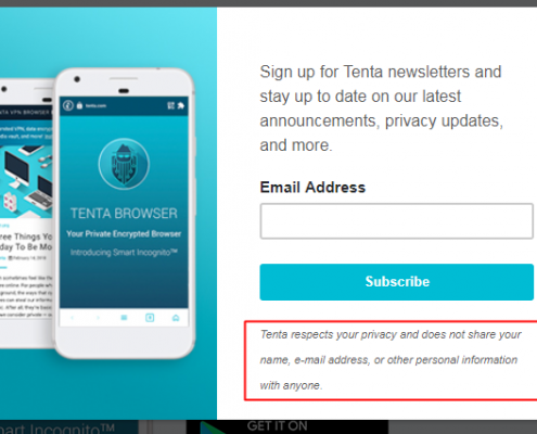
    • A good microcopy convinces users to do something willingly. In the example below, Tenta’s newsletter reminder reassure users that they value privacy and will not give out personal details such as name and email address.
    • Generally, people are hesitant if they should sign up or not. Plus, it gets more difficult if users are required to pay for the subscription. Therefore, a microcopy can really help in reassuring users that every transaction is secured and privacy is not breached.

      Tenta explains their privacy settings.

  • Helps boost your website’s engagement.

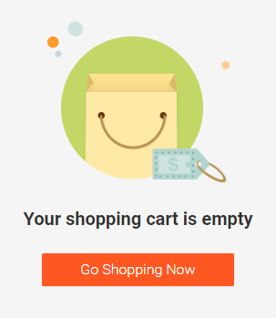
    • Microcopy can give your users a nudge to do something. The example below is Shopee’s cart page. When the shopping cart is empty, it encourages people to go shopping and keep searching for products they might like.
    • The best thing about this microcopy is that it is paired with an image. A shopping bag is smiling at the users to give them a friendly and subtle hint to stay and shop some more.

      Shopee’s empty cart is smiling at you.

  • Help users know what to expect.

    • In Facebook where privacy is a main concern for most people, a microcopy is inserted in many parts of the website.
    • In the settings where you are asked on who can see your friends list. You can set it to “only me.” However,  below that, there is a reminder that your friends control their own Timelines. Your activity with a certain person will be visible in their Timelines. So, your friendship can be seen in the News Feed and other parts of Facebook even to those people you are not friends with.

      Facebook reminds users about the visibility of their friends list.

How Microcopy Can Improve Your Web Design? (Part 1)

We already discussed what is a microcopy and how to write an effective microcopy. For this post, I will explain in detail the many uses of microcopy and how it can greatly help your website. Sometimes, when you are thinking of revamping your website, you think about having a new website design, restructure certain web elements, or rewrite product descriptions. Those are great suggestions, but sometimes, you just need one thing: microcopy. Microcopy helps by lessening their apprehensions and concerns. You need to choose the right words and it should answer specific questions that the user’s have.

  • You may ask how exactly does it takes away certain fears?

    • Irrevocable changes.

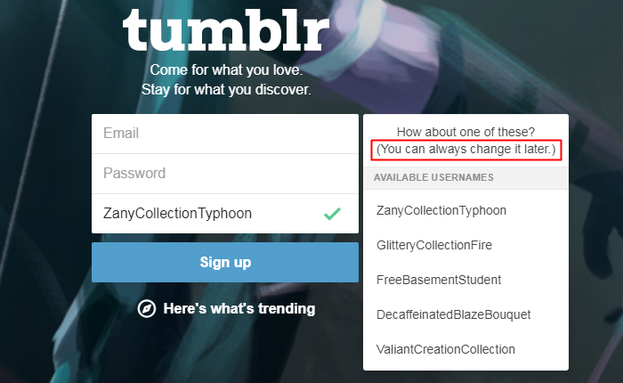
      • My example here would be Tumblr’s sign up page. If you look at carefully at the picture. You are guided to input three things: email, password, and username. For the username, they ask for a specific blog name and they even gave suggestions for you to make your username unique.

        tumblr sign up page.

      • If you want to change it in the future, you can. To remove the fear of being assigned a permanent name, Tumblr promises their users that “you can always change it later.” That small and simple statement really helps because users won’t worry about choosing the wrong username.
    • Countless number of emails.

      • Microcopy can calm the users and assure them that they won’t be flooded with unnecessary emails. So, make sure to give them an idea that you will only send this x number of emails or better yet indicate on your page that you don’t spam emails with information that subscribers do not want.
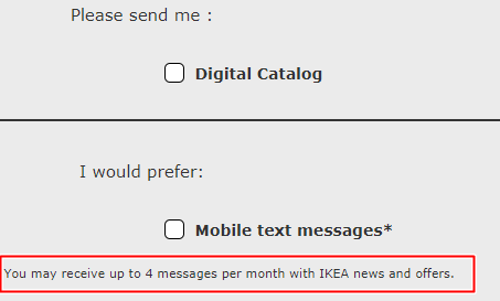
      • Look at the IKEA sign up form below. Users are asked if they either want a print, digital catalog, or even mobile text alerts. They are guaranteed that IKEA will only send up to 4 messages a month. That way they won’t hesitate to share their personal details.

        Ikea’s catalog options.

    • Data loss.

      • No one likes losing 30 pages of research and extensive data analysis. Hours of toil will all be useless if the data provided are not kept safe. An autosave feature along with a microcopy could go a long way and could provide relief to many users. For this reason, the nightmare of many users will be alleviated and the fear of suddenly losing the results of their hard work will be erased.
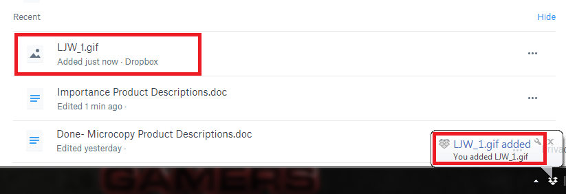
      • In the example below, Dropbox offers a real-time update both on the desktop app and on the website. The app notified that a .GIF new file has been added or saved into the provided Dropbox account. If you look at the website version, the same is indicated. A new .GIF file has been added along with a list of recently edited files.

        dropbox notification

      • Certainly, this simple notification saying that “a file has been added just now” erases all the doubts that any progress has NOT been saved. It provides relief that the files are safe and secure.

Therefore, Microcopy may be small in size, but it definitely has a big impact.

Almost all users would ask, “Why would a website need so much information? I just want to get on with my purchase.” Generally, people are  afraid of putting their personal information online because they think it’s somehow an invasion of privacy. That’s why it is important to add a microcopy to provide further explanation. Hence, it is important to stress certain statements to help users have a positive web browsing experience.

7 Tips in Writing An Effective Microcopy

facebook login

Microcopy on Facebook’s login form.

Microcopy may be a small thing, but it doesn’t mean it is insignificant. It takes more than good writing skills to create a compelling microcopy. There are various elements to consider and I will list several helpful microcopy tips to make your website more user-friendly and easy to use.

  • Tip 1: Design a microcopy from the user’s POV.
    • For the most part, microcopy is not for your users. It is there to help them complete whatever form or transaction they need. You can only design a good microcopy if you consider the user’s perspective. Ask yourself a variety of what if questions and put yourself their shoes. What would be the questions they would ask? Is there a process that could have been handled better?
    • It is important to identify the different areas that are clear, and the sections that needs improvement. Every step of the way, the given microcopy should be able to address the concerns of website visitors.
  • Tip 2: Microcopy should be brief and precise.
    • Microcopy isn’t added to bring color or flavor. It is there to guide. When writing one for your website, be sure to use short sentences or even phrases will do. Your web visitors won’t have forever to read through your detailed instructions. It is called microcopy for a reason because words are supposed to be condensed and not lengthy.
  • Tip 3: Jokes are not for everyone.
    • What is funny to you is not funny to another person. Be careful when you add a little sense of humor to your microcopy. Jokes are very subjective and it really depends on the person reading it. Aside from that, what may sound good in real may not be appropriate when written down. Readers may find it very offensive and rude of you to say such things.
    • For example, after filling out a complicated and wordy sign up form, you will jokingly inform your website viewers that you lost the data inputted. Imagine how that “Oops! We didn’t save that. Please try again.” That would definitely infuriate your users. Instead of creating a cheerful atmosphere, an inappropriate joke will cause unnecessary stress.
  • Tip 4: Add images to your microcopy.
    • Words and pictures are the perfect pair. When words fail, a simple photo guide will greatly helpful. Collectively, they work together to assure the users that everything is fine and they are on the right track.
  • Tip 5: Do not use jargons.
    • Remember that microcopy is added to simplify highfalutin information. Do not bombard your users with complicated and confusing terms. As much as possible, use natural language and write as if you are talking to another person. When your users can relate or identify with you through your language, they will surely trust you. They will be thankful that you made things easier for them!
  • Tip 6: Be cautious when using idiomatic expressions.
    • Like jokes, not everyone will “get” the idiom you are using. Some people will be less familiar with it because of terminological and cultural differences.  Remember tip number #2! Stick to simpler terms and phrases. Straightforward microcopy is the best way to go with it.
  • Tip 7: Test your microcopy.
    • No one gets it right the first. There’s always a “practice” round. Good things take time and it also applies to microcopy. Test, rewrite if needed, and apply new changes. Allocate some time for experimentation to what works and what does not work. You can even ask your users for their opinion by conducting a usability survey.

That Thing Called Microcopy

Letters

Microcopy: it’s all about the smallest details.

In creating websites or apps, there are those littlest details you may not notice yet they are extremely important. Microcopy is essential to our online lives. On a daily basis, we deal with it. Some of you may have noticed it while some haven’t. These microcopy help guides may be tiny, but they serve a huge purpose. From undervalued cues when you enter a website for the first time to the miniscule prompts on the progress bar that will update on what’s happening. A microcopy is a deciding factor whether a user should or should not continue exploring your website.

So what is microcopy?

  • The tiny chunks of text in an app or website is called microcopy. These are not just texts because they are added there to guide the user. These words are blended well into a page that it may go unnoticed most of the time, but without them, users would end up confused on what to do.

When should you use microcopy?

There are many uses of microcopy and you can know about it in detail on this blog post. The two main purposes of it is a) to motivate a user to take an action and b) to emphasize an important statement.

  • Microcopy helps your users through the several form fields in your website. However, it’s not limited the only the users, but it is also beneficial to you. Because of the cues inserted on form fields, you will gain correct details from your users. You are sure that the details inputted are accurate all thanks to the well-placed microcopy.
  • Microcopy encourages users to click that call-to-action (CTA) button without being much of a hard-sell. It can be used to subtly guide users to do what you want them to do.

How should you go about it?

The microcopy hints and guides will all depend on your branding. Generally speaking, these tips will help you get started on the right direction. Follow the instructions given below:

  • It is important to your user. Design prompts and field from their perspective. Try to know what they are thinking and feeling the moment they see that page on your website. Empathize with your users and let them know that you are on their side.
  • Pay attention to the littlest details. During the usability testing, read and analyze the actual words used. Listen to the opinions of your teammates if certain words create confusion or if these messages are clearly explained.
  • It should agree to your brand. If your brand identity is known to be humorous, add a witty voice. You should be able to guarantee that the unique style and conversant tone of your microcopy coincides with your brand so your users are ensured a smooth browsing experience.

As a final word, you have to make sure the word choices are clear and the statements on point. By the time your users read your microcopy, they should know what they need to do at that given moment. It is your duty to direct them to the right track whenever they take a wrong turn. If they made a mistake, your microcopy should offer a helping hand on how to fix things. More tips on how you should create an efficient microcopy are all here.

B2B vs B2C: Designing The Right Website

When you are building your website, it is important to identify your target audience. Are you directly selling to businesses or are you dealing with consumers? Whether it is a Business-to-Business (B2B) or a Business-to-Consumer (B2C) website, you need to be distinct and straight to the point. The design and details of the website must depend on who the buyer is.

Planning

B2B vs B2C

Both B2B and B2C websites need to come up with an adequate marketing plan. There are instance when both strategies overlap so being aware with the two kinds of businesses will really help you ensure that your website’s marketing strategy is on the right track.

We are going to compare and contrast B2B and B2C companies. We will look into specific elements that are important in each side.

The Process

  • The buying process in B2C website is simpler compared to a B2B. Anyone can just freely browse a B2C website without any problems. The length from choosing a product to actually buying it is shorter.  Customers are guaranteed an easy and effortless shopping experience.
  • Nowadays, B2C websites do not require their customers to register in order to purchase a product or service. They can just quickly select the items they want and click the check out button. Your website will only stand out among the rest if you give your customers an uncomplicated way ordering items.
  • On the other hand, a B2B process is the exact opposite of B2C. It requires a lot of specific details like you need to meet up with a company representative. You will need to submit your proposed plan and the business will evaluate the proposal.
  • After being approved, usually, companies insert their own set of guidelines to be followed. This is common among B2B businesses. In order for another business to avail a product or service, they need to make sure that you can meet their demands. In B2B, it’s nearly impossible to complete a transaction without an initial meet up or a personal interaction.

The Elements

  • Relationships are important in B2B websites. These online businesses focus on a smaller market than the general population. Concentrating on a specific group of customers will help B2B companies to strengthen every relationship it creates.
  • B2B sales take longer than usual because you should consider the company’s insight. It’s more like a give and take relationship. Companies work with you not so much because of your brand’s identity, but it is mainly because of the personal relationship you both developed.
  • With B2C companies, you are selling to different kinds of people. For instance, you selling vegan cookies to the health conscious and double chocolate chip cookies to the chocoholics. There’s also rainbow cookies for kids! So, you have to deal with different types of consumers.
  • B2C companies focus on products instead of offering services. Usually, a B2C company will a variety of products to a very broad market. B2C purchases are shorter than B2B so you need to capture the consumers’ emotion right away.
  • If B2B value relationships, B2C needs a strong brand identity. In order to successfully entice customers, B2C websites should focus on imagery. Creating a need or desire for the product is important. Price drops and sales should be highlighted to get the attention of the customers.

Being able to distinctly identify the difference between a B2B and B2C website will help you generate a marketing plan that fits your business. Then, you can create useful campaigns that will convert website viewers to buyers. If you need B2B tips, just click here while the B2C tips are on this link.

Designing a B2C (Business to Consumer) Website

On the last article, I posted about helpful B2C marketing tips. You may ask, “What is B2C the model?” The B2C (business to consumer) model is the most common business model. If you bought an item online, that online retailer is an example of a B2C website. Any products and services that are sold online through a website or virtual storefront are all considered B2C businesses.

Woman Shopping

A woman enjoying the convenience of online shopping.

The Beginning

  • The B2C concept started in 1979 and retailers would sell their products on TV. Interested buyers would purchase through the telephone number flashed on screen. English inventor Michael Aldrich called this “teleshopping.” Eventually, when the people discovered the internet, domain names became the new avenue for shopping.
  • During the 1990s, e-commerce websites started to pop up everywhere. Today’s top retailers like Amazon, Zappos and Victoria’s Secret are all considered B2C websites. With having a website, a business does not need an actual store to operate. Moreover, customers can easily shop for products in the convenience of their own homes. The B2C model is ideal for fastfood, bakeries, jewelry stores, shoe stores, flower shops, and other small businesses.

How should you design a B2C website?

  • Capture their emotions.
    • This is the main target of a B2C website because it is the emotions that triggers the consumers to buy a product. For example, in the mobile phone market, there are a multitude of options. Still, majority of the customers choose to buy an iPhone even though it has the same features as an LG, OPPO, Nokia, and Samsung phone. Why is this? It’s the feeling of owning an iPhone. Apple’s branding exudes class and elegance.
    • This common in most B2C businesses than in B2B. Customers don’t care of the features and technical specifications. They usually go for the trendier and the popular product.
  • Upselling and cross-selling products.
    • The prices, in B2C, are straightforward. Everyone is offered the same price and the only difference is the shipping fee.
    • To generate more profit, websites upsell and cross-sell their products. Upselling happens when a customer is offered a series upgrades. For example, when you customize a jewelry and engrave a message, that is considered upselling. Wrapping your gift in a box and adding a note. These customizations are not given for free and websites earn more through these methods.
    • Cross-selling is offering more options to customers so that he can add more items to his cart. When you shop online, websites usually recommend you other products that go with your existing purchase. It encourages customers to buy in bundles to avail the free shipping incentive.
  • Talk directly to the customer.
    • When creating a business-to-consumer website, remember that you are only transacting to one person and that is the buyer. This potential buyer does not need justify his decision or need to ask permission. When a consumer is purchasing a product, it is most likely out of impulse. So, take advantage of this by creating marketing strategies that will make them click that BUY NOW button. Provide limited-time offers that are hard to resist like a free shipping option or a discount code.


Four Helpful B2C Marketing Tips

Woman Holding Card While Operating Silver Laptop

Previously, I have discussed about B2B web design guidelines that are helpful for your e-commerce website. This is time around, I will share four useful B2C tips. In 2015,  B2C websites all over the world earned over $24 trillion. As a retailer that caters to specific consumers, you need to step up your game and apply these guidelines. Your target audience is huge so you need a mix of internet marketing techniques to entice a specific group.

  • Engage Through Contests.
    • Ask your audience about their opinion and in turn, they get to win a prize. Have a creative contest. For example, to win a million dollars, your customers can their new flavor ideas for your potato fries. They can also submit their own dance video showcasing your apparel. There are more ideas on how to know your audience’s opinion and at the same time, generate buzz for your business.
    • To this day, contests are the most effective B2C strategy to attract audiences because you will be able to showcase that you trust and value the importance of your audience’s opinions. It gives them a sense of pride that a company values what they have to say.
  • Know Your Audience.
    • If you know that your followers are mostly teenagers, then provide solutions for teens. You can blog about the “Top 10 Holiday Destinations That Teens Will Surely Love,” or “Top 10 Beauty Products that Less Than $10.”
    • Provide useful how-to’s for your products. If you are selling makeup products, then post a video on how to achieve a certain look. Provide tutorials for audience so they will constantly visit your website for more exclusive tips and tricks.
  • Make Social media Your Best Friend.
    • Whether your business is B2B or B2C, social media is relevant. This is how you will interact with your audience. It provides a real-time communication between you and your customers. Thus, you will be able to personalize their shopping experience and give more of what they actually want.
    • Your customers are bombarded with advertising messages everywhere. The key to be able successfully apply social media to your advantage is to have a clear target. Interact and do not just broadcast your messages. Post creative videos and blogs that will be useful to them. Add humor and pop culture references to your advertisements.
    • You might ask about the social media platform to use. Facebook is undoubtedly the most popular choice today. However, there are also websites like Twitter, YouTube, Instagram that has a lot of followers. Know where there are more followers and focus on that!
  • Lure Them Back.
    • In the digital world, there are a lot of distractions. Your customers’ shopping experience can get derailed by the constant pop-ups and notifications on their mobile phone. It is important to be able to redirect these customers back on track. You can send them a follow-up email regarding their abandoned shopping cart. B2C websites need to come up with unique ideas on how to make the abandoned carts hard to resist. You can insert a sense of urgency like the it’s almost out of stock or the discount code is about to expire.

Effective B2C marketing requires intense research and content creation. Some B2C websites focus on their app and mobile content while there are others that focus on social media engagements. It’s really up to you decide on strategies that work for your online business.

Meta Tags for SEO in 2018

Meta tags are still important. True, they may not be as important as they once were, but they are still important. So, while keyword stuffing has long been dead, intelligent use of meta tags to help humans and search bots is still alive.


Today, we’ll look at how meta tags work in 2018, the meta tags that you should ignore, and the ones that you should focus on.


But first, what is a meta tag?

A meta tag provides data about your page, usually for search engines, web browsers and social media platforms. This can be data on a range of factors like what the page is about, who wrote the page and what the page should be ranking for.


In most cases, the tags are added to the start of the page in the head tag. This means that they can’t be seen by humans but are one of the first things that a search bot will see.


Meta tags and SEO

Let’s get one thing clear, meta tags aren’t as useful for SEO as they used to be. That’s because search bots have got so much better at identifing what a page is about and its level of quality. They just don’t need to be told by meta tags. But meta tags are still useful. That’s because they can still influence how your site looks on Google, Bing and social networks. And how your site looks can have a big impact on how many people actually click on your link.


So what meta tags can you forget about?

There is one meta tag that you can completely forget about. That is the keyword tag. Google simply doesn’t use it anymore to be guided as to what a page should rank for. In fact, using the keyword tag and stuffing it with keywords can actually hurt your rankings. Our advice: don’t use it at all.


What meta tags should you care about?

So if you can forget about meta tags, what tags should you focus on. There are three trypes of tags that we recommend every site owner take care of.


Page title

There is actually one meta tag that still has some actual SEO relevance. That is the page title. Putting your focus keyword in your page title still gives you a ranking boost, so make sure you do it. But also think about how your page title looks to humans. This will be the first thing they see in Google so you want to lure them in and encourage them to click on your site.


Meta description

The meta description backs up your page title. Google doesn’t use this anymore to find out what your site is about, but it does still display in under the page title in Google. That means you should make it enticing to people.


Social media tags

Finally, there are two social media tags that you can use to improve the way in which your site appears on both Facebook and Twitter. One is Open Graph, Facebooks meta tag, and the other is Twitter Cards. Like page titles and meta descriptions do for search engines, these tags edit the way your site appears when someone links to it on Facebook and Twitter. As such, you can use these tags to make your links look better and increase click through rates.

© 2017. All rights reserved. Phoenix Website Design • Sitemap • (602) 388-8622
20 E Thomas Rd #2200, Phoenix, AZ 85012
Phoenix Web Design

Serving: 

Apache Junction, Avondale, Buckeye, Carefree, Chandler, Chandler Heights, El Mirage, Fountain Hills, Gilbert, Glendale, Goodyear, Litchfield Park, Mesa, New River, Paradise Valley, Peoria, Phoenix, Queen Creek, Scottsdale, Sun City, Sun City Grand, Sun City West, Surprise, Tempe, Tolleson, Wickenburg