What is microcopy and how does it impact your website

What if we told you there was one little tweak to your website that could significantly improve your conversion rates? Well there is, and it’s called microcopy.


What is microcopy?

Microcopy are the small bits of text that help to guide and alleviate the concerns of the user. An example of this can be seen in the image below from MailChimp’s sign up page which lets users know how to pick a username correctly.

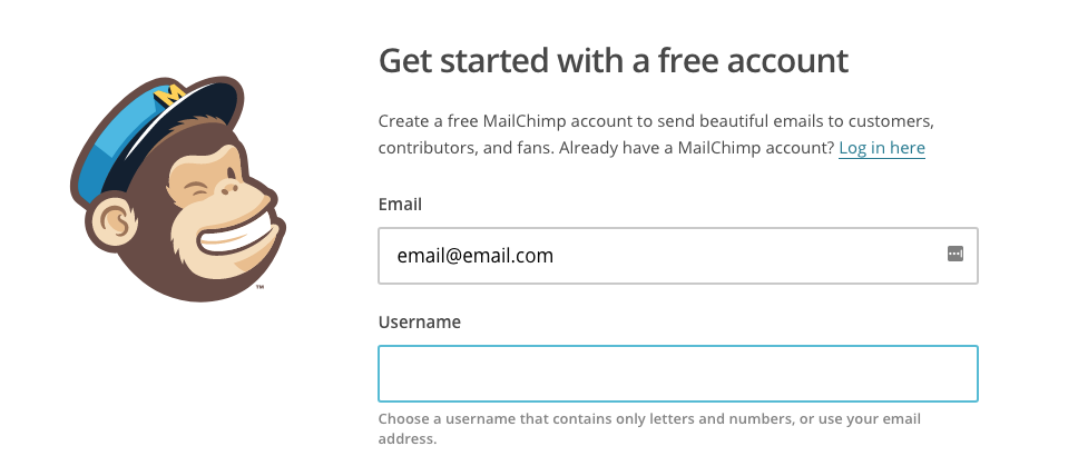
Without it, users could become frustrated if they didn’t know they could use their email or if they used other symbols in their username which isn’t allowed.


Other examples of microcopy can include

  • Form fields
  • Buttons
  • Error messages
  • Reassurance (no spam promises)


It may seem small and almost insignificant, but these kind of touches can have a huge impact on how people use your site.


Why is microcopy important?

There are several reasons why microcopy is important to the success of your site.


It adds info for users

Microcopy should add additional information that a user might need to complete a conversion. When it is used it should eliminate any confusion that good arise and point users in the right direction as in the example above.


It creates a level of trust

You are asking your customers to trust you when they sign up to your product or service. Microcopy can be used to alleviate the kind of trust issues that a user might have by making promises on what you will do (or won’t do) with their data.


It makes your site human

Think of microcopy like a note you might leave on the fridge for your partner. It is a nice touch which adds information or reassurance that they might need. In using microcopy, you create a human element for your brand and make it seem as if you are talking to customers at every point in their journey.


It helps to increase conversions

As you can see, adding these microcopy touches can build trust and connection that make users more likely to convert. The more you reassure them, the more likely they are to convert. For such a small addition, it can make a huge difference.


How you can write microcopy today

If you think your website needs microcopy, it is easy to get started. The first thing to do is to use your website like a first time user. Try to get lost and see if you can make your way through the conversion process. Play ignorant and make a note of any place where you may think you need extra advice or reassurance to continue signing up. Next get someone outside of your business to do the same and compare notes.


Now you have all the areas where you need to add extra touches, you can set about writing them. Remember to keep it simple and offer clear and concise advice.


If you need help adding microcopy to your website, get in touch with our team. We’re on-hand to help you improve the design and conversion rate of your site.

Web design trends for 2018


If you’re creating a new website in 2018, there are certain trends you should be looking to take advantage of. Some of them were already being established in 2017—such as the need for mobile first design—but some are completely new this year. Be careful, however, that you don’t go overboard by incorporating too many web design trends. You still need to make your site clear and user-friendly. Take a look at all of the trends below first and then decide which would be the most appropriate to use.


Big bold color schemes

One of the biggest trends we expect to see continue into 2018 and beyond is the use of big bold and vibrant colors. In the past, designers were a little subdued and stuck to web-safe paletes. Now, however, designeers are throwing caution to the wind are much more likely to use super saturated colors to create big bold designs that catch the eye. It’s never been a better time to use these kind of colors either with monitors now able to offer very high resolution displays.


Mobile first

It almost goes without saying that mobile first design is a necessity. Almost. But we’re still seeing some new designs that don’t work well on mobile. So we’re going to say it again. It doesn’t matter who your website is for in 2018, you need to make sure your site is mobile friendly otherwise Google will penalize it. This may mean creating the kind of site you are not used to seeing, but speak to an expert designer if you aren’t comfortable with it. They’ll be able to show you a range of examples now that mobile first design has matured.


Bigger and better illustrations

If there’s one thing websites were lacking compared to offline media like magazines, it was illustrations. But not anymore. Illustrations are becoming much more common online and are a great way to explain a product or service to your audience. It doesn’t just distill your project into a medium that is easy to understand, however. It can also help your brand to become more approachable. It’s a win-win for your business.


Dynamic gradients

Flat has been king over the last few years. But that is beginning to change. In 2018 we will start to see more gradient colors used in design. They don’t just look cool, they are very flexible to. Adding a gradient to an otherwise dull image can make it look a whole lot more interesting. The same goes for a vibrant colored gradient background. This works particularly well if you don’t have another image to use instead. It’s not a throwback to the app designs of yesteryear, instead it is a step forward into a more mature and interesting way of designing.


If you need further guidance on the best 2018 web design trends to use, speak to us today and we’ll show you how we can build the perfect website for your business.


5 reasons you should add a chatbot to your site


Chatbots are a booming business sector in the online ecommerce world. In 2016, the US market for chatbots was worth an estimated $703 million with a CAGR of 35.2% from 2016 until 2002. Chatbots offer a huge amount of benefits to business owners and ecommerce stores so it is no wonder the market is growing so fast. If you’re wondering about the benefits of chatbots, here are five reasons you should add one to your site today.


Customers can get the support they need quickly

As your business grows, it gets harder and harder to respond to customers by phone or by email in a timely manner. But a chatbot can help with that A chatbot offers away to respond to users in seconds, particularly if it is an AI-based chatbot that can respond with accurate and relevant information. Even the most basic chatbots offer the users the opportunity to leave their question and email address quickly from the homepage of the site rather than searching for a phone number of email address for support.

Chatbots offers personalization

When buying online, people miss the human-to-human contact that used to come with shopping face to face. Personalization is a huge selling point that chatbots can deliver when interacting with customers. Chatbots also offer a level of warmth that is often missing from sites that have cold demands like “Register here” or “sign up now”. Your site’s chatbot could become your online store’s version of a retail salesperson who helps customers with their purchase. Think how much a good salesperson does for your store’s bottom line. A chatbot could be the same online.


Chatbots increase user engagement

Your website needs to engage users like never before if you want to be successful online. If your site can engage potential customers better than your rivals, you’ll get the business, not them. A chatbot is a great way to boost user engagement and keep the customer engaged throughout their time on the site. If they need to speak to someone, the chatbot is there for them.


Chatbots deliver real user insight

AI-based chatbots offer businesses the chance to collect incredibly useful data about their customers which owners can learn a lot from. Leave the chatbot on your site for a good length of time and let it interact with a large number of customers and you’ll quickly gather data that can be used to improve your products and service.


Payments become easier with a chatbot

No one wants to lose customers at the last hurdle and a chatbot can help reduce cart abandonment rates. You can now get chatbots that integrate into the payment process to offer help and assistance to customers when they need it.


If you’re thinking about installing a chatbot, our team of web designers can help you choose the right one for your business and integrate it into your site. Soon you’ll be reaping all of the benefits discussed above.


Navigation menu design trends in modern sites


Designing a navigation menu that works can be one of the hardest tasks for your new website. If you have a lot of pages and information to get across, you only have a limited amount of space to do it in. Luckily, the web is huge and there are a massive number of example that you can take inspiration from. There are also a number of modern web design menu trends that you can use to influence you. As you’ll see, there isn’t a one size fits all option. What works for one site may not work for you. But this list should at least create a few sparks of inspiration that you can use when it comes to designing your sites new menu.


Simple navigation

There is a growing trend of companies trying to keep it simple when it comes to menu and navigation design. The idea is that customers don’t like being overwhelmed with choice and that users have now got used to clicking around several pages to find what they are looking for. What’s more, pages load so quickly now that it doesn’t take a lot of time to browse this way, either. Naturally, this probably won’t work if you’re an ecommerce store. But it should work for more simple portfolio websites.


Sticky navigations

These have become increasingly common to the point where you have probably seen a site with a sticky navigation recently. If you haven’t then it is a navigation bar that sticks to the top of the page when you scroll rather than disappear when you scroll down. The idea here is that it is annoying to scroll all the way up the page to go back to the navigation bar, particularly if the page is long. By always having the bar at the top, users find it much easier to move around the site. The only downside is that it can eat into precious screen real estate.


Sidebar navigations

These are still quite rare but they are becoming more common. Rather than have the navigation menu horizontally positioned at the top of the page, this trend sees it positioned down the left or right hand side of the page. This is more for originality than anything as it is usually far from practical.


Mega navigations

You will have definitely seen this navigation menu before if you’ve been on any ecommerce website. These are the menus that dropdown offering dozens of different categories and subcategories. These are a type of menu in their own right but they have become so commonplace that they need to be mentioned. These type of menus, if done correctly, are perfect for ecommerce stores because of the huge amount of products that need to be found. They can also be useful for businesses with dozens of different services.


If you need help creating your website’s menu, maybe our web design team can help. Get in touch to find out more.

How to make your internal site search so much better


The internal search feature of your site can be hugely important—it’s actually crucial if you are an ecommerce store. But so many internal search systems suck.


The truth is that no one wants to waste their time searching through your site looking for something in particular when they can just enter a few words into a search bar and find it that way. In your brick and mortar store you wouldn’t have your sales people tell customers to find the products themselves, would you? If they were asked a question, you’d want them to take customers to the exact location of a product.


Your site should work in exactly the same way. If it doesn’t here are some strategies to fix it.


Make your search bar prominent

This may seem obvious if you want users to be able to navigate around your site, but it is amazing how many websites we see where the search bar is hidden. Don’t hide the bar away towards the bottom of your page, in your sidebar or even in your footer. Make sure that it is front and center in the navigation bar. It should be one of the first things that users see. Spell it out, too. Don’t just use a magnifying glass icon that opens out into a search bar. Make sure that the bar is long and has the word search in it.


Use an autocomplete function

If your customers are looking for something, you’re going to want to make it as easy as possible for them to find it. Including autocomplete functionality into your search bar is a great way to do this. As soon as a user starts typing in, your search bar will offer relevant suggestions using the first few letters as a guide. It works great in Google and it will work great on your website to.


Allow for errors

Everyone makes mistakes. You do and your customers do. So your site search should allow for spelling mistakes by offering up similar or closely named products that match the search even if they don’t completely match it. There’s nothing worse than searching for a phrase, misspelling by a single letter and getting no results come up. Your site should be much more forgiving than this.


Use synonyms

In a similar vein as the point above, make sure that your site search is smart enough to include synonyms. Sometimes people won’t use the same term for a product that you do. Headphones and Earbuds is a common example, for instance. If your site search is to be really great, you need to cover for all eventualities.


Make sure you tag posts correctly

If you’re allowing customers to search through your blog posts, it’s imperative that you tag them correctly when posting. All relevant information should be tagged to make it as easy as possible for users to find. But don’t get carried away with it, otherwise users will be left with hundreds of pages to sort through.


To implement site search properly on your website, speak to a member of our team today.

How good UX can improve customer loyalty


At a point in time where more customers are viewing your company online than going instore, your website has a lot of legwork to do. It doesn’t just have to sell to online customers, it also has to make up for some of the things that go missing when customers don’t visit you in person. One of the biggest of these is creating a connection between your customers and inspiring loyalty. With no one to offend if you click to leave the website and go to a customer, it can be hard to create the kind of brand loyalty that stores have been inspiring for centuries. But there is one way websites can improve loyalty and that is through great UX. Here is how you can do it too.


Bad UX drives customers away

Before we look at the benefits of great user experience, let’s look at what happens when companies get it wrong. Customers don’t enjoy using a website that has a bad user experience. Typically, these sites are hard to navigate and use and end up being more of a frustration for customers than a help. When this happens, customers are likely to leave and never come back. Even if it’s the website of their favorite store, there’s a good chance they will shop online elsewhere. With so much choice online, it’s not worth sticking with a company that offers bad user experience. How can you generate loyalty with no online customers?

Good UX keeps customers and get new ones

A lot of the focus of websites is on converting users into new customers. But what about the customers that you already have? If you have repeat customers coming to your site—if you’re an online store, for instance—a good user experience will ensure that you design the site with return users in mind. This means making it easier to find what they are looking for and even personalizing the site by using cookies. If customers keep having a good experience every time they come to your site, they will keep coming back.


Good UX creates advocates

Do you know what people do when they find a great site that is easy to use and gives them exactly what they want? They tell their friends about it. And their friends tell their friends. And that site gets loads more customers. The ultimate goal when building customer loyalty is to create brand advocates, the kind of people that tell everyone they know about your brand. Great user experience helps create brand advocates who are happy to recommend their site. After all, no one wants to recommend a site that isn’t easy to use.


Good UX creates a seamless experience

You can only really develop customer loyalty when your brand is consistent across all mediums and especially throughout your website. How else will users really understand your brand enough to become loyal? Great user experience makes sure that wherever they are on your site, a user will have a consistent experience with a consistent message.


If you think your user experience could be improved, our team are here to help. Get in touch today.

Five big problems with website builders


Using a website builder for your next design project can be a very tempting prospect. Website builders appear to offer a lot of benefits. On the face of it they are cheaper than hiring a web designer and easier than coding it yourself.


But there are some huge drawbacks that most won’t tell you about. Why would they? It’s in their interest for you to use their product to make your website. But we’re going to reveal all in today’s blog post. You’ll learn why you should shun website builders and use a proper web designer instead.


It can take a long time to create a site using a website builder

If you think using a website builder will be easy because you don’t have to code, you are mistaken. These products are often far from intuitive and it can take hours for you to get used to using the builder. These are wasted hours that you could otherwise be spending on running your business and making money. If your time is worth anything at all, it probably won’t be worth spending it on using a website builder to make your next site.


You’ll actually spend more than you realise

One big draw of website builders is the cost savings they offer. The prospect of spending just a couple of bucks a month on a brand new website sounds great. That’s until you get building and realize that the basic version of the package doesn’t give you everything you need or want to create your website. To get all the bells and whistles will usually mean upgrading to the most expensive plan which can run to $50 a month. And this cost is ongoing which means you’ll be paying $50 a month for every month you use it. That’s $600 a year.


It could look like everyone else’s website

Almost all website builders rely on templates to create the layouts and pages. So even if you add your own images to the templates, the underlying design and look of the website will be the same of hundreds or even thousands of other website. This isn’t great for a business trying to look professional.


You probably won’t be able to transfer it

So you’ve got fed up with your website builder and decide you want to transfer it away and host your site yourself. Tough. Most website builders won’t let you keep your site if you transfer it away from them. In some cases, the website will actually belong to them, not you. Even if you can transfer it, you probably won’t be able to take the content or the designs with you. It’s not a sustainable option.


Your SEO won’t be great

Being found on Google is hugely important for small businesses. Unfortunately, website builders don’t give you the best tools for this job. Often, the templated nature of them means they aren’t well optimized for search engines and will struggle to rank. Even an expert SEO company may not be able to help you rank a site built with a website builder.


If you want a proper solution for your new website, our designers can help. Get in touch today.


5 Subtle Changes that Will Transform Your Website

Competition is a big challenge in the online world. This means that for your website, keeping it well-functioning and at the top of its game is a must. If not, then you might be missing out on a number of things like higher conversion rates. for example. And this points to how adaptive it is to changes. However, this doesn’t necessarily mean that you need to make some drastic changes. Even the smallest and most subtle ones can do the job effectively. So if you’re still hesitant to jump into  big changes, then we have provided five subtle changes that will surely transform your website.


1. Responsive Design

Not many people will notice it, but a responsive design works like a treat. Your visitors may unknowingly just disregard the fact that your website seamlessly works through a number of devices. But this shouldn’t stop you from doing this. Because once you do, they will surely notice the incompatibilities and therefore would leave your website in a flash. So optimize your website well that its contents and functions are all working on any device.


2. Fresh and Updated Content

You may get tired of writing on your blog but never stop. Publishing fresh and updated content is the best way to keep your site visible and attract more visitors. Also, don’t just use the same old ones over and over again. People, now more than ever, get sick of seeing the same thing repeating. Offer new insights and offer some intriguing content. And make sure that they can share them by incorporating social media platforms.


3. Clear Mission Statement

This may sound cheesy now but a clear mission statement helps make a difference on your website. It basically tells the visitor what you do and why you do it, which helps foster trust between you and the visitors. Providing them some background of your business will enable them to feel comfortable interacting and staying on your website. So make your business be known. This goes for your products as well. Make sure that they know what they are for.


4. Good Website Navigation

Website navigation can transform and benefit your website for two main reasons. One is that it helps your visitors find what they are looking for. And two, it improves your search results ranking.


Website navigation is the feature your visitors will most likely scan immediately to see the content and features of your website. So don’t make it hard for them by using generic and incomprehensible terms. Be mindful and let them be understood.


5. Testimonial Page

To further build trust and foster relationship with your visitors, don’t miss out on creating a testimonial page. This actually helps build your brand reputation, which is necessary if you want your business to be known and acknowledged.

Furthermore, when your clients actually have something nice things to say about you, then you grab the chance and let them. Receive all the praises there is. After all, if you want your business and website to do well, then it should provide the receipts that it does.

7 Key Features No Website Should Be Without

A good website is where visitors will stay. And that is a fact most of us know too clearly. This, then, affects the searchability and visibility of our website. Both of which are vital for your business and website to function.


So if you find that your website is not gaining many visits and is ranking lower than expected, then maybe it is lacking a lot of things. But there is no need to fret if you have no idea what to do. Because in this article, we will tell you the seven key features that your website shouldn’t be without.


Attention-Grabbing Typography

Most people overlook the value of typography when it comes to improving websites. But contrary to that, it actually does a lot more. An attention-grabbing typography helps your customers to immediately identify not only your content but also your brand from the rest of the competitors. A good example that you can learn from is Facebook. Once you see even just that one letter, you definitely know it is them.


A Good Background Video

Nothing is more attention grabbing and informative than moving pictures. By putting up a good background video on your website, you are not only doing yourself a favor but your customers also. When a video automatically plays in the background, it can significantly convey the purpose of your website in just a span of a minute or so. This will boost brand-recognition as well as dwell time.


A Responsive Web Design

We have reached the age where it is possible to access the Internet anytime and anywhere with the help of mobile phones and tablets. Now, people don’t need to reach for their laptops just to look up the web.


Therefore, what your website needs is a good responsive web design that will make your page adaptable to any screen size and devices. Optimize it well so that people can clearly navigate through your website and not leave before they even got the chance to read your name.


Your Business Information

If your website operates in business, then you should never forget to put your business information clearly for everyone to see. This may sound like obvious advice but it is one of the biggest failures people commit. As a result, visitors may tend to just visit and never navigate and react to the website. So keep in mind that your mission statement is clear and the business purpose is evident.


Your Contact Information

In line with the above, never ever miss putting down your contact information. This is one of your ultimate goals and you should not miss it. Place all the necessary information such as contact numbers, email addresses, location, map, etc.


Social Media Platforms

Incorporating your social media platforms on your website helps boost the visibility of your business. It is good and free advertising. So make sure that when people visit your website and they find your content worth sharing, then provide them the tools to do that.


Calls to Action

Finally, to complete the visitor’s journey, you need to provide them with something to do. And that is by placing Calls to Action. If you want them to buy, then make sure that you have the button that will direct them to do that.

How to Improve Your Website’s UX Today

Websites make information accessible, which is why it’s ideal for businesses. However, making a website isn’t adequate because offering an excellent User Experience (UX) is more significant. Your visitors should be given a remarkable UX in order to upgrade their overall browsing experience.


Here are some effective tips on how to improve your website’s UX.


Utilize White Space

Contrary to popular belief that white space is just wasted real estate, it’s actually important to a great web design. White space makes your content stand out and give more focus to the elements close to the text. It also makes your website look trendy, fresh, and open.


Keep in mind though that white text consumes up space and having too much of it might take over some important information. The solution is balance. Determine the most important parts at the top of your web page and emphasized them with some space.


Make It Mobile-Friendly

Mobile devices are starting to drive large traffic to many websites, which is why it’s important that your website responds well to these gadgets. Go mobile-friendly to make your website visible and accessible to any device. Remember not to compromise a UX design with quality.


Keep It Simple

It has been discovered that online users have an attention span of only 8 seconds. That’s why you need to grab the attention of your users as quickly as you can. Get rid of unnecessary information and only include the most significant information about your business.


The best way to organize your homepage is to add anchor links so your users don’t need to scroll the whole page. With anchor links, users will be direct to specific points of the page.


Make Calls-To-Action Eye Catching

Distinct calls-to-actions (CTAs) allow users to navigate the site more easily. Consider the color of the buttons because different colors stimulate different emotions and attitudes. The best colors for CTAs are red, green, orange, and yellow.


Don’t neglect the actual words you’ll use for the CTA buttons. The words should be actionable, time-sensitive, and bold. For example, “Call Today”.


Use High-Resolution Image

There’s nothing more discouraging than seeing a blurry picture of a product. An image helps communicate a message to your customers that’s why you should choose the best quality. If you can use real pictures, then go ahead because they’re more effective than stock images.


Use Bullets

Bullets can help improve the readability of your web page. It allows users to quickly read the information about your product or service. This will help create an attractive proposition.


When making the bullet points, go creative as possible. Use images to make your point more understandable and appealing. With the isolation of the points, your users will understand your proposition more clearly.


Prevent 404 Errors

Next to a slow-loading page, 404 errors are another frustrating encounters of users. This error totally destroys the journey of users to the website. To catch any 404s, use Google Webmaster tools.

© 2017. All rights reserved. Phoenix Website Design • Sitemap • (602) 388-8622
20 E Thomas Rd #2200, Phoenix, AZ 85012
Phoenix Web Design

Serving: 

Apache Junction, Avondale, Buckeye, Carefree, Chandler, Chandler Heights, El Mirage, Fountain Hills, Gilbert, Glendale, Goodyear, Litchfield Park, Mesa, New River, Paradise Valley, Peoria, Phoenix, Queen Creek, Scottsdale, Sun City, Sun City Grand, Sun City West, Surprise, Tempe, Tolleson, Wickenburg