(MORE) Website Blunders to Avoid

accident, mistakes, be careful

Careful on making these mistakes!

There is nothing more frustrating than finding your way through a convoluted website. Satisfy your customers. Show them that you care for their needs by not driving them away.  Clearly, you would want a smooth transaction online and withdraw from anything annoying. Here are MORE blunders to avoid that may help you in achieving that functional website:

  • Tiny Pagination

Pagination is a type of navigation that provides users access to multiple pages of a certain website. When you search terms on Google, numbers 1 to 10 appear at the bottom of page. A next button is also visible for you to click and to navigate your search results. Same is true on websites that have a lengthy list. In some forum sites, the pagination provided are microscopic and insignificant. Help your users by not wasting their time. These list of pages numbers are necessary!

For example, the products on an online shop are divided into several pages. Pagination helps on making your website load faster because not a lot of items are displayed all at once. Thus, your users are satisfied because they can conveniently browse your website.

  • Complicated Sign Up Forms

Certainly, you have visited Facebook during the 24 hours. I am sure you noticed that if you need to create a profile, you just need to fill in a few text boxes. You only need a name, an email, a password, birthday, and gender. Viola! You can now access the whole of Facebook.

Time to ditch long and boring forms! You are providing a hindrance for people to access your website. Keep the forms short and brief. In some online shops, you can even buy items without registering. There is no need to ask for heaps of information because you might end up saying goodbye to potential clients.

  • Too Many Animations

Do not bombard your main page with moving images. Viewers of your website will not know where to look first. Focus on specific products that you want to display first. Utilize the use of pagination. It is exceptionally hard to direct customers to a particular product and also, numerous shifting images can be truly irritating.

  • Bizarre Font Styles

Reading a lengthy text with unconventional typefaces can be frustrating. (Oh, hello eye strain!) Typography is the central part of designing. Do not make reading a painful task to do. Make your website easy to read and to navigate. If possible, use San Serif typefaces.

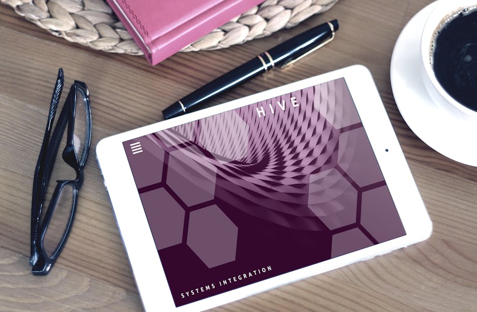
  • Not Mobile Responsive

People are always on the go. They probably will not leave their mobile phones behind.  It would be a huge loss if you ignore the effect of mobile users. Choose a website design that is responsive in all platforms, whether your website will be browsed on a desktop computer, a tablet, or a mobile phone.


Perfection is hard to attain, but these tips will definitely improve the performance and the conversion rate of your website. When designing your website, always put yourself in the shoes of your viewers. Because if they had good experience on your website, they will patronize it and they will tell their friends about it. You will gain rewards in multitude of ways.

Eight Free Fonts

writing, keyboard, typing, fonts

Where to get FREE fonts?

Whether you are doing a school project or designing a website, finding the right font is tough. There are a lot of choices out there and those innumerable options tend to confuse users.  Read this guide for a list of FREE (Yes, free!) Open Type Fonts that you can use and the links on where to get them.

  • Butler by Fabian De Smet 

    This is a serif typeface that is free for both personal and commercial use. (In case you are wondering what a serif typeface is, you can review this article.) Butler is great for books, and other printed materials. Most of all, Butler supports different languages. When you need special characters, it has glyphs to display them properly. You can download the .zip file of the font here.

  • Ostrich Sans 

    The League of Moveable Type has made several free and open-source typefaces that everyone can download. I will list a few of their works. The first of many fonts is Ostrich Sans. It is one of their san serif typefaces. The long and slim design is perfect for subtle titles. Download it here.

  • Eau Sans 

    Aside from The League of Moveable type, fonts by YOfonts will be featured. Eau is French for water. It is a sans serif typeface and it has three variations. You can choose between proportional, lining and old-styled figures. You can try them out by following this link .

  • Melma Font by Rafa Miguel 

    This free for commercial use font includes three varieties: Melma Black, Melma Line, and Melma Cracked. This collection is great for banners, placards, and signboards with its bold and chunky letterforms. For free download, click this link.

  • Opuscula Sans, Serif , and Script 

    When in doubt, try all the types of font. Opuscula can be serif, sans serif, and script. It is very flexible to your needs. The sans and serif are the condensed and thick kind, but if you want an italicized variety, try the script. All three open type fonts are created by YOfonts and you can download them here.

  • League Script Number One 

    If you are looking for a script style typeface, this is for you. Thanks to people of The League of Moveable Type for this modern script font. League Script Number One is fitting for notes, scrapbooks, or even invitations. You can download it here and start writing those personal letters for that someone special.

  • Marta by Michael Chereda 

    Marta is your all-around font. You do not have to worry if you need to type in figures, symbols, and ordinals. This diverse serif font collection supports languages like German, Czech, Russian, and even Latin, and Cyrillic ligatures. You can download the bold, regular, and italic versions for free.

  • Blackout 

    If you want to make a statement, you can be loud with Blackout. This is another creation of The League of  Moveable Type. With this font, people will surely notice what you want them you see. Want to try it out? Click here for more details.

Website Blunders to Avoid

website, failure, mistakes

Avoid these mistakes!

Practical and functional websites make profit. They win the hearts of the customers.  How can you make profit if your website looks awful? Your website should have a clear structure and uncomplicated navigation. The last thing you want to do is to chase away potential customers. Check out this list of mistakes that you should definitely avoid.

  • Broken Links
    In the world of online shopping, broken (or dead) links should be avoided. You will use a potential customer if your website links do not redirect to the desired product. People are always searching for things to buy and the links you provide are important in helping them to get the products they want. You can check for broken links using this free link checker. Avoid the “page not found” error at all cost!
  • Small Font Sizes
    How can you invite people to buy your products when they cannot even read product descriptions clearly? Customers like to search and browse for new items so verify that these texts are readable and the search results are understandable. The longer they are, the harder they are to read.As I have mentioned above, links are important to get to a specific product. Make sure these links are clear and legible. Customers should be able to distinguish the link and the description where it leads to. Same is true with buttons like Shop Now, Add to Cart, etc. Make sure these buttons, links, and search results are large enough for customers to read.
  • Unclear “Contact Us” page
    I can personally relate to this. I am really particular in shopping for books. It should be in this edition, under this publisher, and so on. Rather than rummaging through over a million books, I usually contact the website and have them search for me instead. Some websites do not even have a clear phone number and email address for inquiries. I get the generic website email that probably will not get opened in a few days. I do not mind waiting, but it is not always the case. Usually, customers are impatient. They will find another website that will cater to their needs. Provide contact details that will guarantee a response. Most importantly, do not generate an automated response. It seems very impersonal and it will drive people away.
  • No (or inactive) social media accounts
    This is related to the mistake above. Everyone now has a social media account. Advertise your official accounts together with your contact details. People tend to search for your business and inquire online. Answering questions quickly means good customer service. You give a positive impression that you want to help out customers and you care about them. You create that inviting atmosphere that will surely get loyal customers. Engage with people on Facebook, Twitter, Instagram, and those people will spread good things about your website in return. You can repost or retweet the positive feedback you got and certainly, it will encourage other people to shop at your website.
  • No search boxes
    Most of the time, customers know what they want. Give them an easy access to that product. Whether you have five or a million products, always provide a way to search and to refine the existing search results. Prevent Choice Paralysis. It is always good to provide your customers many options, but when there’s just too much, customers get confused.

Need more? There is another list here!

Four Things You Should Know Before Building a Website

computer, internet, website

What makes a good website?

Websites are not only about codes, images, and latest designs. You are building a place for visitors to know more about the products and services you offer. Everything you put into your website should be essential towards a certain goal. Like in any project that you do, it requires extensive planning. You would not want to waste money on something you would never use.

  1. What is the purpose?

Define your goals. What do YOU want? Do you wish to sell online? Perhaps you want to inform people? Or maybe you just want to share your hobby and entertain your readers? Write everything down. Put your thoughts on paper first. You do not have to make a website right away.

  1. What to put?

Every single element you will include in your website should coincide with your identified goals. It is important to know what information will your website’s visitors find relevant. Of course, you would want to show the world your work! Think also of what your audience needs. Do not exhaust them by letting them read long and boring paragraphs. Give them value. So, if you own a business, do not just put the photos of your products. Provide information on how and where to avail these products. Add other significant information like email and contact number. They can just call you if they have questions or if they wish to make reservations. If you have a physical store, provide a detailed map. Content should always be informative!

  1. What photos to use?

Aside from great content, using the right images also help. Gather photos by utilizing free stock photos or you can even use your own photographs. You want those images to make a mark and you would want it to have a lasting impression. You can always buy photos, but purchase only photos when needed. There are already tons of free photos out there. This list of websites may help you.

  1. What design to use?

You are very happy to have created a visually appealing design, but when you previewed it, it causes eye strain. You have allocated days to create that perfect design, but then, I am sure it will be outdated in months. Learn the fundamentals of design and typography. Remember, you do not have to need to fill every corner of your website. Design is more than the visual aspect.

Consistency is key. Do not use all the colors of the rainbow. When in doubt, use white space. Highlight the important details. Make text larger so it will be easy to read. Choose a set of fonts and stick to it. Lastly, the design should be flexible. It should be viewed properly in all browsers, and in all devices. Plan what works for you and what does not. This will help you narrow down your choices rather than changing deigns from time to time.

Making a website should NOT be expensive. This is still the initial phase. You should be well geared before starting that website you have been dreaming of. Having the content, images, design you need will help you get there faster. Chances of everything crashing down are higher if you are not prepared. If you are ready to take that leap and move on to the next level, this guide will surely help you!

A Short Guide on Choosing the Right Font

font, reading, typeface

which font is the right one?

When choosing a font, you might think picking the prettiest looking is the best choice. Nope, that is not always the case. Typography is a huge territory. Before I dive into details, let us first define the word font. What is a font? A font is the style (bold, italic), size, typeface (Calibri, Garamond, Arial, etc.) of the words you type. When we think of font, we usually mean the typeface. Choosing a font is like choosing your outfit. You pick a dress depending on the occasion. Same is true with fonts. You do not use fancy fonts on your resume. You use those on birthday invitations. This guide will help you on the different types of fonts, the things to consider in choosing a font, and the places to get FREE fonts for commercial use.

Basically, there are four classifications of fonts: Serif, Sans Serif, Script, and Decorative. The Serifs are the ones with edges. The most popular example of this is Times New Roman. Sans Serifs are the opposite of Serif. They have no extra lines on the edges. Trebuchet, Century Gothic, and Comic Sans are just a few examples of it. (This article uses Sans Serif!) Scripts are the cursive style or the handwriting style. Refer to typefaces like French Script, Monotype Corsiva, and Bradley Hand. Lastly, the decorative ones are the beautifying  fonts. They are usually used for special purpose like the typefaces Jokermann, and Curlz MT.

Now you know the various classifications, let us discuss the importance of choosing the right fonts. Fonts set the tone and mood of your text. Imagine the full text of the Bill of Rights printed in script style and in size 12. No one would ever want to read that. No one would take it seriously. Viewers will just close the page and find another website that offers the same content. If your websites’ tone is formal, you better not choose anything cursive. Stick to Serifs. If your website is about a hobby like drawing or reading, you can choose playful styles or the handwriting styles.

You also have to consider the readability of the font. Consider if your preference makes it easy for viewers to read your content. Look at the size, color, spacing. Legibility, on the other hand, is the ability for the viewers to distinguish the different letters and numbers. In some fonts, number 1 can be mistaken as lowercase l. These things can confuse readers so make sure your font is both readable and legible.

It is important to know the purpose your material. If you are making a business card, you need a font that is readable despite the small size. If you are sending an online invitation, make sure the font is readable on screen. Take into consideration your audience, too. Older people tend to prefer bigger fonts. If you think your target audience are adults 40 and up, then, you might want to consider thicker fonts. You can always experiment which fonts work, but at the end of the day, make sure it represents your brand.

For the FREE fonts, the first website to check is Font Squirrel. You do not have to refine your search on what is available for commercial use because they are all 100% free commercial fonts. Next on the list is DaFont. This website offers selected commercial fonts. Make sure to check the free option when searching. They have a wide selection of fonts and they are not the common ones you see. If you are looking for a font for your Christmas card, look no further. The third option is Google Fonts. Who would have thought Google would give tons of free fonts? Yes, they are all open source so you are welcome to modify and use them commercially. The downside is you will not get anything unique. If you are looking for decorative fonts, check the previous two.

There you have it! After you have applied the guide, test your fonts by conducting a survey on your website. You can also have some beta testers browse your website and ask for their feedback.


SEO by Linkhelpers

SEO by Linkhelpers

Many people have no idea what SEO (Search Engine Optimization) is all about. However, it is necessary for online business owners to understand how to use the tool to increase buysiness. In order to research any product or service, the clear majority of potential customers will use a major search engine, such as Bing, Yahoo, or of course Google. These potential customers seldom, if ever, research these products or services beyond the first page of the search engine results. Therefore, it is paramount that any online business website rank on the first page of the search engine results. Otherwise, potential customers won’t know what products are available from the online business website. This is the most valuable technique that any online business owner can make.

Linkhelpers can optimize any online business website to ensure that the website will rank on the first page of the search engine results. This will help to ensure an increase in potential customers, an increase the number of potential customers that become paying customers, an increase in overall revenue, and ultimately an increase in profit for the online business owner.

Linkhelpers has numerous years of experience in optimizing online business websites. However, this is no easy task. The algorithms that are used by the major search engines are constantly changing.

Increasing the rank of any online business website so that it ranks on the first page of the search engine results is no easy task. It takes an in-depth knowledge of the website as well as the current algorithm for the major search engines. SEO that isn’t done properly can reduce the ranking of a particular search engine. There are various disciplines used to optimize an online business website. Therefore, it is paramount that the SEO provider that is selected guarantee their results. Linkhelpers has many years of experience in these disciplines and guarantees satisfactory results. Online business owners will see a dramatic improvement in the number of potential customers that become paying customers, overall revenue, and profit for the online business owner.

Linkhelpers understands that the only way to obtain increased online business is to satisfy past online business owners by producing satisfactory SEO to ensure repeat customers. The vast majority of Linkers online business owners are repeat customers.

Linkhelpers guarantees that any online business website will rank on the first page of the search engine results, within six months. Within that time period, online business owners will see an increase in the number of potential customers that become paying customers, an increase in overall revenue, as well as an increase in the profit for the online business owner.

Guide on How to Password Protect and to Disable Comments on a Post

computer screen

Do more with WordPress

Do you want to password protect? We can help you with that. For whatever reason you have – whether you wish to create a exclusive page for your viewers, to post company related links for your new trainees, or to share personal photos of your family to selected friends – this easy guide will surely help you.

If you have your website in WordPress, the first you need to do is to add a new post or page. Make the necessary edit and before you publish it, be sure to check the dashboard on your right. You have there indicated: STATUS, VISIBILITY, PUBLISHED, and so on. Focus on VISIBILITY. The default option is PUBLIC. Click on edit to select a different option. Choose now the PASSWORD PROTECTED option instead of public. Set the password you would like for that post or page on the textbox. Do not forget to click OK to save the changes you have made. Once it is published, any viewer of that post or page will be required to enter the password you designated.

You can change the password if desired. In fact, you can create password protected posts as many as you want. Be sure not over share your password. It defeats its purpose if you give everyone the code. Like any password protected information, constantly change your passwords and make sure it is alphanumeric.


Next is the tutorial to disable or enable comments. Sometimes, comments are annoying and some posts do not need comments especially if the purpose of the post is just to inform. Bots give unwanted comments and most of the time, they leave copies of the same spam comment. You will not have that problem of managing the comments section again, you can now disable the comments for a particular post.

If you have your website in WordPress, you have to open the post you wish to edit. Like the previous tutorial, check the dashboard on your right. On the upper right, you have the options: Screen Options, and Help. Focus on SCREEN OPTIONS and left click on that to access more options. There will be several checkboxes shown. Look for the DISCUSSION checkbox and do not mind the others. Make sure there is a check mark on its corresponding box. Now, you have to scroll down the page. Just below your post editor, you will see more options for the discussion option you recently checked. To disable comments on that post, uncheck ALLOW comments. You will no longer receive comments for that specific post you are editing. If there are comments prior to disabling hide, comments will be hidden until you allow them again. To reverse the changes you have made, you just have to undo the step and check ALLOW COMMENTS. Do not forget to click on update to save the recent changes you have made.

The two tutorials are easy peasy, right? They may seem mundane for now, but when your blog gets a huge following, these features will help you a lot. You can now set aside a private space and disable comments when necessary.

Five Ways to Make your Website more Functional

computer, searching, buying

online shopping

Websites have been a great tool for sales and marketing. Now, people prefer to shop online than go to an actual retail store. They search for directions and contact numbers online before they actually decide to drive for miles just for one product that they have been anticipating for a long time. If you are business owner, this list will give you an idea on how to make your website beneficial and useful to your target audience.


  1. Have clear Call-to-Action buttons.
    What are these CTA buttons? These are the “Shop Now”, “Buy Now” buttons customers can click to access your available products online or they can be “Contact Us Now!” sign wherein you added your business’ phone number or email address. Give those important details and make sure they are within reach. Do not make customers click several pages just to get answers.
    Having an FAQ page also helps. You can list all the frequently asked questions in one area and give it a concise answer. Adding fluff and flowery words will not help. These are your action items. You want these items to help your customers and hopefully, they will end up buying something from your store.


  1. Do Not Require to Sign Up.
    Websites these days have an option to “Shop as Guest”. Registering before you can buy online is not necessary. If you require customers to sign up, you just made a stumbling block for potential sales. Impulsive buyers will change their minds if the buying process is tedious. Let your customers shop with ease and with less textboxes to fill.


  1. Provide Guides.
    You have now a “Buy Now” and customers can shop as guest. The next tip is to educate your customers. Provide tutorials on how to shop smoothly. Help them on how to achieve the product’s fullest potential. For example, if you are selling beauty products, you can include make up tutorials perhaps. You can also provide style guides if you are selling dresses. Give out visual guides on outfits for various seasons. Whatever your business might be, set a page for customers to learn.


  1. Simplify your Site Design.
    I have always said this in my previous posts, too. You do not have to choose a colorful design. Embrace the white space so customers can see your products clearly. Allow them to click on images for better viewing experience. Keep the design simple. However, you can make your CTA buttons vibrant. You make these buttons stand out. Make customers want to click that “Shop Now” button. Do not focus on the design; focus on the buttons.


  1. Make sure your links work and make sure customers know that these are links.
    Check all your buttons. It would be a shame if someone decides to buy and then, your “Shop Now” button did not work. Verify that these important links get redirected to the correct path. You would not want to see an HTTP 404 or the page not found notification.
    If the customers are searching for a particular item, make sure that these links are visible and that they know it is a link. These links will help them get to a product that they want. If you want to find out if your website has 404 errors, check this out. (I hope I made that link identifiable or else, I failed at following my tip. In case you missed it, this website will help you catch 404s!)

Starting a small business online? Make these investments!

online business

planning an online business

If you are turning a business into something that is accessible to anyone around the world, there are certain things you need to deal with. Time to say goodbye to brick and mortar, and say hello to the world of online stores. What are things needed? The checklist includes: a website design, domain name, good host, and creative photos.

Let us start with the website design. The theme of your website should be simple yet professional looking. Like a house, you need to choose the color palette that suits your needs. The key here is not to get the colorful one, but to get the light and fast design. It has to be responsive in all platforms, whether it will be browsed on a desktop computer or a mobile phone. It is important to consider your mobile viewers. People are always on the go. Here at Phoenix Website Design, we cater to both large and small business. If you are working on a budget, we have various design packages that will be perfect for you.

Next is you have to have a domain name. The name should be, of course, relevant to the content of your website. It also has to be unique. Add your own flavor so your website will stand out from similar online stores. It is going to be your identity so you need to make sure people will recall it. Keep the name simple and short as possible. Remember, no one likes a very long and complicated address. People might not find your website.

A good host means reliable host. If the domain name is your address, the host is your house. If your house constantly has outages, a sparkling address is useless. Ask yourself these questions. Will my website be guaranteed to be running 24/7? If the host cannot provide you good uptime scores, consider other options. Cheap rates are not always tantamount to good hosting. Your business is online now. Your customers are from different parts of the world. You have to be always open for business. Will my website handle numerous orders simultaneously? Make sure your website never goes down despite heavy traffic. For now, you are still starting. Check if hosting is flexible for future plans of expansion. Will my website load quickly? The customers’ time is limited so speed is ultimately important. Go for a host that loads content fast wherever the customer might be.

Lastly, unleash your creativity! Go get your point-and-shoot camera. Upload images with your posts and social media updates. Learn to use photo editing softwares. An expensive program and a DSLR camera are not necessary. You just need a basic photo editor that allows you to add text, resize, and trim your photos. (I have discussed the importance of compressing images here.) If you feel like you do not have the photography skills, do not fret. You can always find stock photos online. You can purchase artistic images for your website. In case you are wondering where to get FREE photos, I have compiled a list here.

Easy to Follow Tips to Have a Speedy Website

website

reduce waiting time


We all want everything to be fast, right? We have so many tasks to do, and so little time. Thus, speed is important in websites. Internet users do not have all day to browse for answers. I will not dive into jargons and bombard you with heavy technological terms. In this post, I shall teach you a few easy tips and tricks to help your website load faster.


  • Tip #1: Always compress your images.

Vivid imagery is essential, but the sad truth is images also take up more page size than texts. When your website has a huge page size, it means it will take time to load. I am not saying that you should remove all images. You have to reduce the images’ file size or reduce its resolution. Like for example, a picture with a 1280 x 768 resolution is unnecessary. Yes, for a wallpaper, it will do. That is not needed in a blog post.


  • Tip #2: Simplify your theme.

Choose a fast and simple theme. All the beautiful user interface and colorful design will be useless if you have a website that does not load immediately. No matter how visually pleasing your design is, it will definitely annoy visitors if the site is slow. I suggest you keep it simple first and then, little by little, add something to optimize and enhance the look.


  • Tip #3: Clean up your website.

As you post numerous articles in your website, you will gain followers… and you will acquire a lot of junk. Like your house, you also have to constantly clean your website. The post drafts can take up space. If you have more than twenty revisions, you better clean those up. Another one that you could do is to delete those spam comments. Ten copies of the same comment are totally redundant. Anything that is not required should be eliminated. A little dusting can boost your website. No need to be pack rat!


  • Tip #4: Remove unused images, plugins, themes.

This tip is related to the previous one. Over time you will upgrade your website so those previously used images, plugins, and themes should be removed. Those images that you uploaded, whether you use them in a post or not, will consume your website’s space. It is better to say goodbye to those unattached pictures. For plugins, you have to deactivate it first and get rid of the ones you do not utilize anymore. If you are already using a new theme, there is no need for you to keep the old one. Out with the old, in with the new.


  • Tip #5: Organize your homepage.

Shorten your posts. Do not show the full post immediately on your homepage. Provide only a snippet of what viewers can expect. Limit the posts you will show in one page. There is always a “next” button or a “show more” option that visitors can click. Do not bombard them with all the information right away.


After applying all those tips, you can use a tool called Pingdom to test your website’s speed. You just have to enter your website’s address (or URL) and ─ viola! ─ you can see the results right away. It is very easy to understand. “A” is the highest score a website can get. You will also see the page size there. If your images are not compressed, it will reflect. Loading time is also indicated. You will know how long it will take for your website to load in seconds.


© 2017. All rights reserved. Phoenix Website Design • Sitemap • (602) 388-8622
20 E Thomas Rd #2200, Phoenix, AZ 85012
Phoenix Web Design

Serving: 

Apache Junction, Avondale, Buckeye, Carefree, Chandler, Chandler Heights, El Mirage, Fountain Hills, Gilbert, Glendale, Goodyear, Litchfield Park, Mesa, New River, Paradise Valley, Peoria, Phoenix, Queen Creek, Scottsdale, Sun City, Sun City Grand, Sun City West, Surprise, Tempe, Tolleson, Wickenburg