Phoenix Web Design – The Importance of Writing Numbers as Numerals

Want to know a secret? Numbers stop wandering eyes.

Yes, I’m not kidding.
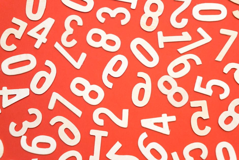
Lots Of Numbers

Lots Of Numbers

Numbers like 23, 19, and 47 make your readers halt.

Let me explain further! Nowadays, most web visitors like to skim and read only the important points. Most likely, they’ll read a paragraph that interests them, but it’s highly unlikely for them to read the entire page. So, if you want to get their attention, it’s better to write numbers as numerals (ex. 56) and not as words (ex. fifty six.)

If you want your readers to pause and spend more on your page, it’s recommended to add numerals into the mix of words that they choose to ignore.

  • Why is this? What’s so special with numbers?
  • Because numbers represent facts, which is something users typically relish. Sometimes people are looking for specific facts, such as a product’s weight or size, so product pages are certainly one place where you should write numbers as numerals. But even when a number doesn’t represent a product attribute, it’s a more compact (and thus attractive) representation of hard information than flowery verbiage.
  • How does this happen? How can they locate the numerals?
  • The eyes can easily detect numbers because the shape varies. Aside from that, it is obviously different from the letters. If you put numbers and letters side by side, the numbers will stand out than the ABCs.
  • From anyone’s peripheral vision, 8080 looks totally distinct than the words: eight thousand eighty. Even if I don’t make the example bold, still, the numerical value stands out over the spelled number.

Bottom line: adding 1, 2, 3 (or any number) increases scannability of your content. In the digital world, we all know that scannability and readability are extremely important.

Ditching the conventional writing style

If you consult English textbooks, and other print media, numbers are written in words.  Many grammar books tell you to spell out numbers. They specifically tell to spell the following:

  • any number that is the 1st word in any sentence.
  • any number followed by hundred, thousand, and so on. (ex. one hundred)
  • round numbers (ex. when you round off 84 to the tens place, it becomes 80. So, you spell that as eighty.)
  • huge numbers (ex. five million dollars)
  • any number from 1 to 99.

However, when you are in the World Wide Web, the writing style varies. So, if you are writing a blog post, or any content, these are the guidelines to consider:

  • View numbers as digits (ex. 500, and NOT five hundred)
  • Even if it’s the first word in a sentence, don’t spell the numbers.
  • 8324 is better than eight thousand three hundred twenty four. (see the previous bullet point.)
  • Indicate the numerals for numbers up to 1 billion only.
  • When numbers reach a trillion or so, just spell it out. (6,000,000,000,000 look annoying already. So, for this, writing 6 trillion is a better option.)
  • Spell out numbers when it is just a rough estimate. (ex. We surveyed over a hundred customers regarding the website’s usability.)
  • If you know the exact numbers, it’s okay to use digits. (ex. We surveyed 125 customers regarding the website’s usability.)

Phoenix Web Design – Tips on Designing Your Website’s 404 Page (Part 2)

When your web visitors stumble upon a 404 page, it doesn’t have to end in disappointment. This is your chance to make up for the faulty navigation. You can take the wheel and guide them to take a step back or to go to another page that may interest them. The best way to present navigation options is through a 404 page.

How to transform 404 pages into helpful pages?

How to transform 404 pages into helpful pages?

These are the tips you can apply when designing a 404 error page:

  • Add images that go well with your message.
    • First, you to think of what you are going to say to your web visitors. The next thing that you should do is to find an image or create one that fits your message. Usually, the first thing that gets noticed is the image displayed. The chosen image helps stress your desired message.
  • Limit the given options.
    • Don’t overwhelm your already frustrated web visitors. Aside from the stunning visual as previously stated, also offer them a clear navigation. Sure, colorful and funny images will entertain them a bit, but they are there because they are looking for something.
    • Help them reach their goal, which is to find a specific page. The next thing you can do is to offer navigation options. Don’t push them further into the dark.
    • Basically, you can offer 3 practical options when they encountered an unexpected error:
      • Web visitors can go back to the last working page to help them trace where it went wrong.
      • They can also go the main page of the website so they can start a new search and look for other things that may interest them.
      • The 3rd is having an option to report the error. Give your web visitors a chance to explain the situation and report the bad link. This way, you are aware of the existing problems your customers are experiencing. You will know what parts need immediate attention, and you know what areas to focus on in terms of designing the overall atmosphere of your website.
    • Aside from the options presented above, you can also provide these helpful tools to help them even more:
      • Live chat feature.
      • I know a lot of people find chat bots extremely annoying. However, in a specific instance where a customer is lost, chat bots or chat assistance is really helpful. Adding a live chat option can help guide customers to the right direction. You create automated messages and guide web visitors to links and resources. If the issue is not resolved, a customer service representative can answer their queries.
      • Search box.
      • Another technique is to provide a search box on the 404 page. Web visitors can start a new search or use similar keywords to their existing search. Maybe the 404 page appeared because of a small typo. This search box can help them find what they looking for.
      • FAQ.
      • You can also use this opportunity to answer common questions regarding 404 and other related errors. This is your chance to explain the causes, alleviate their frustration, and offer solutions.

One last reminder — whatever design modification you choose to apply, make sure the options are applicable both on mobile and on desktop. Your 404 page don’t have to be harbinger of disappointment. Instead, offer solutions that are simple and easy to follow. In case you missed part 1, revisit and read the previously discussed tips.

Phoenix Web Design – Tips on Designing Your Website’s 404 Page (Part 1)

If you don’t know, a 404 page appears when someone clicks a broken link. It’s a standard response to a non-existent page. However, not a lot customize the error message on the 404 page. Typically, it will just display a message that the link you clicked is “NOT FOUND.” Depending on your preference, you can choose to apply unique message prompts. Web designers tend to deviate from the traditional approach.

In this post, I will give you tips on how to creatively present your 404 page, and how to help web visitors navigate into a page that’s 100% working. Read the helpful tips below:

  • Tone it down!
  • Your web visitors are already frustrated that they got an error upon clicking a link. This your opportunity to pacify the situation, and remind them that the people behind the scenes are working on it.
  • It wouldn’t help if you will just give them a generic prompt, making the page impersonal and cold. This will just make your web visitors more frustrated and leave the your website.
    • How to lighten the mood?
    • Be like a friendly customer service representative.
    • You can customize your 404 page using a friendly tone. Design it with an inviting and warm atmosphere. Remind them that you are still fixing it. Say something like, “Hello there, are terribly sorry about that. You are seeing this because the link you clicked may be incorrect or outdated.”
    • Share a joke.
    • Your web visitors already feel bad because they see an error. Lighten up the situation by cracking a joke. Insert puns to ease the inconvenience. For example, “Ooops! The link is broken. Now, our hearts are too. Let us find you a match ASAP!” Then, below the message, you can provide more options for them to clicks.
  • Broken links... and other broken things! </3

    Broken links… and other broken things! </3

    • Be sassy.
    • You don’t have to be always following a certain path. Grab the attention of your web visitors by showing an image of literally a broken page like Blizzard’s 404 page. Yes, it may shock them, but it offers a cheeky and unexpected response.
    • Add interactive games.
    • When you visit Kualo and you can’t seem to go to a link provided, it will say that the invaders took over the page. A game similar to Space Invaders will then appear. Guess what? It’s an actually game. The bearer of bad news becomes a highly addictive game. Now, that’s a creative way of turning an error message to a fun and interactive page!
    • On the plus side, if you score over 1000 points, you will get a web hosting discount. This proves that 404 pages need NOT to be a source of disappoint. It can also be a bearer of good news!
    • Deep web.
    • Yes, your 404 page can be friendly, sassy, and funny. However, this is also a chance to be informative! You can suggest other helpful links on your website. Offer them articles that will teach them new things.
    • The National Public Radio’s 404 page offers a list of people and things that also mysteriously disappeared. One popular example is the American aviation pioneer, Amelia Earhart. It will surely make you forget about the broken link. Instead, you will ponder about the intriguing story you just read.
  • That’s it for now! If you want more 404 design tips, part 2 is posted here!

Phoenix Web Design – 4 More Elements That Should Be In Your Product Page

Person Browsing a Website's Product Page

Person Browsing a Website’s Product Page

If your online store is not gaining any revenue lately, it’s probably not the product that’s faulty. Perhaps, you need to tweak your product page. You may need to enhance your product page and add certain elements that effectively turn web visitors to customers.

In this blog post, I’m going to share 4 more page elements you can add to your product to convert web visitors. Previously, I have shared 4 elements already so this post is just a continuation of that.

Be sure to include these elements in your product page:

  • WRITE CREATIVE PRODUCT DESCRIPTIONS

    • When you are selling popular products, most likely you are not the one selling it. So, try to be different and don’t just the description given by the manufacturer. That will just make another generic product page that sells the same merchandise.
    • An online store tried to change their product description and the results were very clear. The website gained an 84% increase in web traffic by editing 10% of the descriptions. Surely, the impact would be greater if the online store wrote descriptions to more of its product pages.
    • Give a detailed product description because like product photos, the descriptions help customers imagine themselves using the product. So, indicate how the product will make their daily lives easier.
  • CREATE AN FAQ PAGE

    • Of course, customers will always have questions regarding the product. Not everything will be discussed in the given description because it will just make your product descriptions boring and longer than usual. So, you can talk about the specific details on an FAQ page.
    •  You can include a link to the FAQ page on every product page. The goal here is to answer common questions, and to alleviate the customers’ doubt. They will understand more about your products, and know more how you do business.
  • OPTIMIZE FOR MOBILE DEVICES

    • In 2017, more than 34% of online sales were achieved using mobile devices. As more and more people rely on their mobile phones, the numbers are predicted to skyrocket in the coming years.
    • This is an indication for you to optimize not just the desktop version of your website, but also the mobile version. Both desktop and mobile should reflect the same information. The style, format, theme, color scheme should be consistent with the desktop version.
  • ADD URGENCY

    • In this day and age, people have a fear of missing out on things. So, when customers see that you have a flash sale for only one day, they will immediately add items on their cart. Use this fear as a leverage for your website to gain more traffic and revenue.
    • There will be a sense of urgency if you add countdown timers on your home page. Also, add huge banners that the sale will end soon.  They will surely click it so make sure a list of discounted products will be provided.
    • For more psychological tricks you can add on your website, I have listed them all here.

Phoenix Web Design – 4 Elements That Should Be In Your Product Page

If you have a fairly new website and you’re striving to gain sales, maybe it’s time to revamp your product page. How to do that exactly? Don’t worry because I’ve got you covered. I will share 4 easy product page modifications in this blog post. For each product page element, I will explain it in details and elaborate by giving you tips. Are you ready?

Macbook Pro Beside White Ipad

These are the essential features of a product page:

  • EXCEPTIONAL IMAGES
    • Customers won’t be satisfied without seeing a preview of the product. That’s why some people still prefer going to brick-and-mortar stores. As an online store, the best thing you can do is to replicate the shopper’s experience by providing high-resolution photos of the product. Another way is to provide a photo that has an exact dimension of the product. Make sure also that you can provide photos from different viewing angles.
      • Pro Tips:
      • As much as possible, keep the background of the photos white. Multicolored products stand out more on a pale background.
      • Include photos of people using the product so the potential customers can anticipate the measurements of the product. For example, they can foresee that the item is slim and pocket-size.
      • If the product is available in different colors, provide sample photos of the item in various colors.
      • Make sure that customers can zoom in the product photos so they can see the intricate details and other visible features of the said product.
  • OFFER A FREEBIE
    • Dr. Robert B. Cialdini, author of the best-selling book Influence: The Psychology of Persuasion, shared that people can’t say no when they are showered with free gifts. You can use this as leverage to your web visitors to make a purchase. Offer a freebie once they purchase selected products on your site. Perhaps, you can also offer a free shipping voucher for first-time customers.
    • Limit freebies to prevent abuse of the current promotions. For example, each purchase can only have a maximum of 2 free items. Also, another tip is to pair it up with existing products that need a little boost.
  • FEATURE THE BEST REVIEWS
    • Don’t brag about having the “best” products on the web. Your customers will only trust fellow buyers. So, feature the outstanding reviews from your customers. List your highest-rated products. When they see raving reviews of a product, web visitors can’t help but click on the item. They will be curious on what the fuss is all about.
    • According to BrightLocal’s survey in 2017, 73% of the customers surveyed shared that they trust online stores more when they highlight ecstatic reviews on their website. Just make sure to not share too many 5-star reviews because it’s pretty impossible to satisfy each and every customer.
  • GROUP SIMILAR PRODUCTS
    • When web visitors browse for products they might like, they would not like every product click, right? So, this is your chance to suggest other items they could enjoy.  If you suggest more products, then, it will lessen your bounce rates. They wouldn’t leave your website immediately or abandon the page. You are giving your web visitors to look at other products. Thus, increasing their chance of discovering a product they actually like.
    • Like Amazon, you can include a “products related to this item” section. You can also say, “customers also bought this item.” Don’t hesitate to share your product recommendations because they might help out someone in need of it.

Phoenix Web Design – What Makes a Product Page Effective?

A product page is an important part of your website.  These pages should be enticing enough to encourage engagements, and eventually, lead to sales and revenue. A good product page should be able to catch the customer’s attention and motivate him to add the products to his shopping cart. Most websites allocate their resources to make their product pages more interesting, engaging, and convincing.

Browsing the web on a macbook

Browsing the web on a macbook

In this blog post, I will create a short list for you. I will also create a follow-up post regarding the specific page elements. For now, let’s discuss the basics first on what makes a product page compelling.

A good product page should have…

  • A sharp, high resolution photo: A product page’s most important aspect is its photo. In the world of online shopping, a customer wouldn’t buy a product if he is doesn’t know what he is buying. An unintelligible photo is big NO for product pages.
  • A bulleted list: Customers don’t have time to read long product descriptions. They prefer to skim words in bullets (like this list!) If you have a succinct list of product details, it is easier for your customers to find a product that he wants. For online bookstores, the dimensions, publication date, publisher, imprint, and ISBN are usually present in a list format.
  • A general overview: Of course, not everything is in bullets. You also have to provide a short description regarding the product. For example, if you are selling a book, you need to add the synopsis. By reading the provided synopsis, the customer can decide if a book appeals to them or not.
  • Other features of a product page include: call to action button like buy now, shop now, or add to cart. You also need to add social proof or reviews from other customers.

Basically, these elements constitute a great product page. Your product descriptions are an important part of the page. Let’s continue to use the book example. The synopsis and genre will help grab attention of your customers.

Don’t just focus on the product. Allocate time and effort to formulate creative descriptions.  Keep in mind who your customers are and personalize a product description that appeals to them. Also, write about the features of the product, and highlight the benefits of it, too! You mix and match until it suits your target audience.

Learn from Amazon.

Let’s take a look at Amazon’s product page and learn how they are designing their product page. They topped the list of the biggest e-commerce retailers in 2017. So, it’s only natural to learn from the best among rest. Apple, Wal-Mart, and Macy’s were the runners up.

  • If you look at Amazon’s best sellers in the point-and-shoot digital cameras section, the number 1 camera is a Sony DSCW800/B 20.1 MP Digital Camera. The product page includes a specific title, 7 product photos, 1280+ reviews, a list of product features, many more.
  • The title of the product listing was very specific. It includes the model number and the megapixels of the camera. The customers can easily search the web for other details regarding the camera. Then, there are several photos provided, and it even automatically zooms in the moment you hover on a photo. Plus, there are bullet points that highlight the specific features of the digital camera.

Phoenix Web Design – 5 More Words That Will Help You Gain Your Customers’ Trust

German words on paper.

German words on paper.

If you’ve read the previous post, you’ve already read the 6 words that will help you gain the trust of your web visitors. This time around, I will give you 5 more words. Are you ready? Read all about them below:

  • Imagine.
  • When you ask your customers to conjure a mental image, they use their imagination. In these stories, they are the main protagonist. Thus, “imagine” will help you in letting your customers think they need a product or service in their life.
  • They will imagine themselves in a better state using your products. As a salesperson, when they have imagined something, you just need to give them one last nudge, and definitely, they will click that “buy now” right away.
  • Senses.
  • You don’t need to use the word “senses,” but you need to use verbs on sensory experience.
  • Some examples include: see, watch, sound, hear, and many more.
    • For instance, you say something like…
    • Want to see how our state-of-the-art product works? Watch a live a demo here.
    • The words “see” and “watch” awakens people’s senses. You will be able to immediately get their attention.
    • So, use sensory language as a way to tap on people’s auditory and visual sensation.
  • Name.
  • Calling your customers by their name will make them feel special. When someone calls you by your name, they have your attention. You immediately stop what you are doing, and check who called you.
  • Same is true for email messages. You wouldn’t read a generic sales email. However, if you see your name on the subject line, you will stop and read what it’s about. Don’t hesitate to call your customers by their given name because they will pay attention better with whatever product or service you are offering them.
  • Power Words.
  • The English language is brimming with a plethora of words that evoke strong feelings of encouragement, fear, joy, and safety. Know how to use these “big” words at the perfect moment. Here a few power words you can add to your page titles, blog posts, and banners:
    • Phenomenal
    • Terrific
    • Breathtaking
    • Awesome
    • Best-selling
    • Authentic
    • World-class
    • Thorough
    • Secure
    • Unbeatable
  • Because.
  • Ellen Langer, a professor of psychology at Harvard, shared her research study regarding the word “because.”
  • She asked a group of people if it would be okay for them when somebody decides to cut a long line. Here are the sentences she used when she requested to break in line:
    1. Excuse me, I have 5 pages. May I use the xerox machine?
    2. Excuse me, I have 5 pages. May I use the xerox machine, because I have to make copies?
    3. Excuse me, I have 5 pages. May I use the xerox machine, because I’m in a rush?
  • The results concluded that how you write/say your request really affects how people would respond. When she did not give a reason, only 60% people agreed. However, when she stated that a specific reason (see sentence 2 & 3), more than 90% of the people allowed her to cut the line.
  • What’s the moral of the story? You should always include a reason behind your action.
  • So, don’t ask your customers to fill out a survey without explaining why you want such information. Tell them the purpose of their given input.


Phoenix Web Design – Words That Can Help You Gain Your Customers’ Trust

Without words, you won’t be able to your audience to check out your website. Words are your weapon. These words will help you convince web visitors to convert into customers. So, your word choices are important in writing product descriptions, creating blog posts, and composing marketing emails. Below are the 6 important words that will help you gain people’s trust.

  • You

  • Write in the second person POV. Always assume that you are directly talking to them. One way of doing that is using the word, you.
    • For example, The shirt suits you because it is comfortable and is built for everyday use.
  • For the most part, you are selling to your customers. Talk more about the benefits of your products, and not about your company. Every time you see yourself from talking from your perspective, always go back and try to find a way to rephrase it to the viewpoint of your customers.
  • Do

  • Instead of using the word “try”, go for “do.”  For instance, “try to change the settings by…” say, “to change the settings, do this and do that…” This makes you more skilled and authoritative. Thus, your readers will have confidence following your instructions.
  • And

  • When you use the word “but,” it implies a negative connotation. The word “and” is a solution for you when you are dealing with unfavorable comments or contradictions.
  • The word “but” signals that you are about to say an antagonistic statement. “And” is an all-embracing word that makes you seem to agree even though you are at odds.
    • Take a look at these 2 examples:
    • “We stayed at home, but we just watched The Wizard of Oz.”
    • “We stayed at home, and we watched The Wizard of Oz.”
    • The second sentence seems like they enjoyed the 1939 movie, while the first sentence says otherwise. It’s as if they weren’t excited that they were watching a classic movie. Word choices really make a difference.
Assorted Quotes Hanged on Wall

The words that motivate you.

  • Or

  • Don’t ask your customers if they would like to buy your product. Instead, give them a wide array of choices. If you only present one single option, their only choice is either to accept or to reject. However, if you provide them multiple options, you have increased your chances of receiving a yes from your customers.
  • So, don’t just tell them to check out your products. Instead, tell them that you offer it in different colors and size. Would they like it in red, blue, or yellow?
  • Should we … ?

  • Ask your readers. You don’t have to constantly tell them that “you should check this” or “you should do that.” It seems that it’s very bossy and pompous of you. Rephrasing propositions as interrogative questions encourages the customers to be open-minded. It extinguishes the idea for the conversation to go awry.
  • Support

  • According to Matthew Dixon and Brent Adamson’s The Challenger Sale, sales representatives should express agreement and work as one to show “support” or “unity.” This could have an influence on your buyer’s mindset. It enhances your customers’ purchase experience because they are sure that there’s an entire team ready to help whenever they encounter trouble. It strengthens customer relationship and brand loyalty.

Phoenix Web Design – More Tips on Writing Product Descriptions

In the previous post, we have defined what classifies as “good” product descriptions. This time, I will discuss further the said topic by giving you 4 more tips on how to write product descriptions that actually sell. Read all about them below:

  • The tone is dependent on your brand.

  • A good product description should sound like you. Is your brand more relaxed, chatty, and informal? Is it rather elegant, smart, and sophisticated?
    • If you are selling casual wear to the millenials, there’s no need to sound like you are selling Gucci. Casual wear focuses on personal comfort more than formality. Try to use words that are suitable for everyday use. Find words that are homey, laid-back, and simple.
    • Describe the feeling of the dress rather than discussing the materials. Wearing this textured sweater will make you feel cozy. Your text and your brand go hand in hand.
    • However, if you are selling high-end dresses, words will be more refined. It would be described as “chic,” “exclusive,” “intricate,” and “unprecedented.” Of course, when is it’s a $1,000 dress, expectations are high.
  • Whatever you choose, make sure to be meaningful to your brand. Word choices should be connected and coherent.
Words Text

The power of words.

  • Make your descriptions easy to scan.

  • Scannability is important because people won’t read the entire description. They love to skim and just proceed to the important points.
  • If you are not direct to point, they will find another retailer that will be providing a concise product description. People won’t have time to every little detail. So, provide a short summary and highlight the most important ones.
  • If there are other essential details, use bullets to provide a clear description. The bullets will break the huge chunks of texts, and provide a remedy for monotonous sentences.
  • So, when you are unsure what to write, use bullets. Talk about the product’s unique features and benefits rather than blabbering about the technical specifications.
  • Add influential words to the mix.

  • After using bullets, it’s time to add words that will definitely boost your products.
  • Here are some of the most influential words, via David Ogilvy:
    • Amazing
    • Sensational
    • Remarkable
    • Revolutionary
    • Miracle
    • Magic
    • Quick
    • Easy
  • For those who do not know, David Ogilvy is a known advertising tycoon, dubbed as the “Father of Advertising”. He is founder of Ogilvy, a creative network.
  • Adding any of these words your product descriptions transform from being simple to special. Words help change people’s minds.
  • Don’t for forget to optimize for search engines.

  • Words are not just helpful in descriptions, but also for SEO.
  • Placing keywords in product descriptions and product titles help boost your rank.
    • According to Shopify, you should include keywords in four places the SEO for your website:
    • page titles
    • meta descriptions
    • product descriptions
    • alt texts
  • Your meta descriptions should also be the same with the product descriptions. However, if you think product descriptions should be improved, try adding creative words. Generally, adding specific keywords to the page title and product descriptions help in terms of search engine optimization.

At the end of the day, if it works for you, don’t change it. In most cases,  an effective product description is something that is short and straight-forward. If your website offers a short and sweet product description, it’s all good.

Phoenix Web Design – Writing Effective Product Description

Aside from product photos, another factor that encourages customers to purchase an item is the product description. People do tend rely on words when shopping online. One study shows that 20% of transactions do not push through because of insufficient product information.

Good vs. Bad Product Descriptions

Because it’s lengthy, the description is automatically “good.” NOPE, the length has nothing to do how good a product description is.

A good product description is able clearly tell you.

  • what its use to your life
  • why you should buy it

When you’re selling shirts online, it’s pretty easy to write descriptions because everyone uses it. However, if you are selling something unique, that’s when you need to explain further. This is where you need to be detailed in creating your product descriptions to eliminate any confusion.

On your website, product descriptions should:

  • plainly and openly define the use of the product.
  • highlight the benefits.
  • add other important information like technical specs for mobile devices.

The product description should be able to tell the customers what they need to know.  A bad product description is the total opposite of clear. If a customer still has questions about a product, then, the description failed miserably.

Description Scramble

Tips on writing effective product descriptions.

To prevent that, I’ve listed helpful tips for you in order to create effective product descriptions.

  • Think of your potential buyers first.
    • You just don’t go on and write flowery descriptions to entice people. Consider these points before you draft your product descriptions:
    • Age, Gender, Location
    • Education and Income standing
    • Language(s) spoken
  • This will be your guide on what to write because you have identified your target audience. If you don’t know who your buyers are, you would know how to write the product description, and what to include (or not include) on your list.
  • Let’s take a look at Apple’s iPad. Everybody knows what it is so the product description focuses on the tech specs of the product. It presents you the differences on size and weight, buttons and connectors, built-in cameras, apps, sensors, chip, battery, and compatible accessories.
  • However, if you are selling a beauty product, the appropriate product description is quite different from the iPad. This time around, you need to add what is in the beauty kit, how to use the product, and the benefits to your skin.
  • Include the benefits and special features
  • Motivate your customers by highlighting the product benefits because they will always ask, “What’s in it for me?”
  • Point out that your product addresses a concern. So, if you are selling shirts online, anticipate what your customers will be asking about. Most probably, it’s the color options, available sizes, feel, and level of comfort.
  • Give them a reason to buy your shirts, and one way to do that is by adding a list of specific benefits & extraordinary features.
  • Here are some notes for you:
    • A long list will just bore your customers so pick your top 3 important benefits.
    • Elaborate the advantages of buying your product.
    • Explain how it provides a solution to your customers’ existing problem.
    • Think of your buyers when listing the benefits. If you know they’re buying a product because it’s cheap, then, highlight that you are selling the cheapest product in the market.
© 2017. All rights reserved. Phoenix Website Design • Sitemap • (602) 388-8622
20 E Thomas Rd #2200, Phoenix, AZ 85012
Phoenix Web Design

Serving: 

Apache Junction, Avondale, Buckeye, Carefree, Chandler, Chandler Heights, El Mirage, Fountain Hills, Gilbert, Glendale, Goodyear, Litchfield Park, Mesa, New River, Paradise Valley, Peoria, Phoenix, Queen Creek, Scottsdale, Sun City, Sun City Grand, Sun City West, Surprise, Tempe, Tolleson, Wickenburg